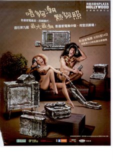
It's a funny visual that catches our eyes. The message is "don't live in the stone age of old electrical appliances". The idea is there. How do we make good use of it ? First, we need to manage the execution carefully. Look, there is no body copies per se. All the details and headlines, whatever you'd like to call them, are not really placed in a reader-friendly manner. Do we expect our reader to eye-ball search all the words ? What's more, it is not selling any solid benefits that attract consumer to check out the exhibition. It just says "the biggest and hottest exhibition". As a consumer, I just feel indifferent.

 It's a funny visual that catches our eyes. The message is "don't live in the stone age of old electrical appliances". The idea is there. How do we make good use of it ? First, we need to manage the execution carefully. Look, there is no body copies per se. All the details and headlines, whatever you'd like to call them, are not really placed in a reader-friendly manner. Do we expect our reader to eye-ball search all the words ? What's more, it is not selling any solid benefits that attract consumer to check out the exhibition. It just says "the biggest and hottest exhibition". As a consumer, I just feel indifferent.


Comments