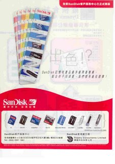
Sandisk ad

The intended key message of this ad is clear to us : Sandisk has a wide variety of products to suit your different needs. And the creative idea makes use of an analogy with a Pantone Guide. That's the trouble. If our target audience have never seen a Pantone Guide before, how can they be connected with such analogy ? Then this has become an issue of relevance.


Comments