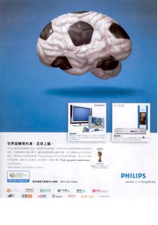
Philips print ad

World Cup, an event relevant for promoting TVs and DVD machines. This ad is qualified as a good one in terms of execution. A clean attention-grabbing key visual to attract us to read on, size of product shots in right proportion and copies in right length. How about the creative idea ? It's either you love it or you hate it. A colloquial saying, 上腦, expresses World Cup fever. A brain-shaped football (even with the veins on it) is taken as the key visual. You may be disgusted but it attracts you. Remember there is a creative idea called "Shock Tactics" ?


Comments