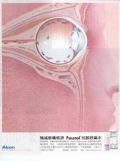
This is another example of how execution fails to deliver an idea. The creative idea is there. A surreal representation of the problem - when you have itchy eye, it's like ants running around inside. Not a bad idea at all. However, the colour combination kills it all. Everything is pinkish and the tiny ants are in brown colour. Such combination just fails to bring out what it wants the readers to see. If the ants were in black, it would be better already. There must be a thousand more colour combinations that work. Is it ignorance or negligence ?
 This is another example of how execution fails to deliver an idea. The creative idea is there. A surreal representation of the problem - when you have itchy eye, it's like ants running around inside. Not a bad idea at all. However, the colour combination kills it all. Everything is pinkish and the tiny ants are in brown colour. Such combination just fails to bring out what it wants the readers to see. If the ants were in black, it would be better already. There must be a thousand more colour combinations that work. Is it ignorance or negligence ?


Comments