Posts

Showing posts from July, 2009

3 USB Wireless Modem TVC

Image
Guess I'm out of touch with the current cantopop secene. There are 3 young singers in this ad. Are they well-known ? Don't know why 3 has shot a TVC for this promotion. The offer is quite trivial : a special Yahoo edition of USB wireless modem plus free viewing of Yahoo. Would it be better to just advertise on the Yahoo website ?

Blue Girl promotion TVC

Image
Blue Girl launches a big scale promotion in summer time every year. Different from previous years, it seems that it tries to target the younger drinkers at bars and pubs this time. It's an interesting promotion ad that plays on 大獎 and 大掌 phonetically. Yet the prizes don't quite look too attractive. The grand prize is a gold bottle together with piggy bank, bottle opener, beer mug, T-shirt etc. Would it be motivating to the younger bar and pub drinkers ? I wonder.

Cafe De Coral 霜花牛板燒飯

Image
I have to say Cafe De Coral is quite creative in coming up with new dishes and menus. When I first saw this ad, it got me to think it was talking about the "real" Teppanyaki. It made feel a bit excited. How can it be possible ? I asked myself. Then the VO explains later saying : 親手整更啱自己. Is that anti-climax intentional ? Putting the ad aside, this DIY 霜花牛板燒飯 still sounds quite interesting.

Bio Essence bus ad

Image
As marketers, we are always look for new and creative media. The media scene is always cluttered and we need to find ways to make our message stand out. Advertising on the inside of the bus top is new and creative but isn't it a bit awkward ? I was lucky to sit the back and so I could see the whole ad. There are like 10 people like me who have such luck. I would rule out the potential of advertising on the inside of the bus top. Just that the advertiser has just ignored how people can see the ad in terms of creative and layout.

SPACE outdoor ad

Image
It's the high time for different schools to compete for students who can't get into F.6 or local universities. HKU SPACE in particular is quite aggressive and has spent quite a bit on outdoor advertising. Maybe education organizations are not used to putting up advertising and their ads are usually of lower standards compared with the ads of commercial products. In this case, it's an outdoor ad with blue words on blue background. The words just can stand out to catch attention.

Mad Avenue Blues

Image
Speaking of the shift in media consumption, I just remember a video shared by one friend. It's funny but very true. Enjoy and have a good weekend.

McDonald's Delivery TVC

Image
TV stations have been putting up numbers in front of us saying that TV media remain as the key media with stable viewership. We all know these researches are misleading somehow and contradictory to what we know by observation. The younger generation don't really watch TV that much and their media consumption on traditional media is on decline. We all know also that they count on Internet for news and entertainment. The question in every marketer's mind is how to make use of this free medium. There is no easy answer. I have just noticed this TVC from McDonald's. What if it's aired on YouTube exclusively ? Probably, we can forget about TV in this case in fact.

Watsons TVC

Image
While Mannings focuses on consumer promotions, it's interesting to find that Watsons works on the store image with this ad featuring Kay Tse . Playing on the facts about the body, the ad tries to position Watsons as the drugstore that takes care of every part of your body. Remember the "your personal store" positioning of Watsons in the past ? It's a good positioning to own but it's long forgotten in the minds of the consumers. It seems it's trying to re-own that again.

Biopoint print ad

Image
I always pay special attention to hair growth product. This ad is not too creative. Even the tie of the talent is not quite properly worn. Hahaha... The product sounds innovative. Sticking a patch at the back of your ear is quite an easy application. Wonder if it really works. If it does, it deserve a better ad...

Cadbury TVC

Image
Been busy with packed teaching schedule and missing the new ads on TV. Students told me there is a very funny TVC from Cadbury and asked me about it. Like the Heineken ad, it's enjoyable admittedly but it fails to connect with the brand, what it stands for or it wants to stand for. Ask this what if question. What if the same ad is used on another competitive brand ? Is it the same ? If the answer is positive, you would know it may not be a good ad for the brand in a marketing point of view. As far as I know, this ad is a Cannes winner. I can only say creative ads may not be ads that sell.

Vita Green Lingzhi print ad

Image
Long time no talk about ad execution. What does this ad say ? Vita Green Lingzhi is the best choice to combat against swine flu. That's the key message of the ad. But it's a classic example of many "all-you-paste" ads where an ad is not treated like an ad but a notice board for putting up whatever thought to help the selling. The supports to the key message, "No.1 in sales", "scientifically proven", "recommended by doctors" and the testimonial, are scattered all over. Plus the logo, headline, sub-headline, slogan and the promotion tag-on are put put wherever there is space. And there is a lack of creativity to catch people's attention. The result is an ad no one is interested in reading.

Raid print ad

Image
On and off we see products advertise about the fact that they are greener than others. Here is one of those. Somehow I feel the concept of green-ness is over-rated. To HK consumers in particular, it's something nice to have rather than a motivational attribute to switch to a particular brand. They are more calculative and care about what the products can do for them for the price they pay. So while this ad may make Raid existing Raid users feel good about their brand, only a handful of other brand users may switch to it.

Solvil ET Titus print ad

Image
This ad serves two purposes. It's image building for the two watch models supposedly, by attaching a statement to each model to represent two opposing attitudes. It also tries to increase involvement by lining up a poll at a website : http://www.timeislove.com.hk/ In the website, you can vote, leave your point of view and create your own avatar. Is this a good initiative ? Well, there may not be too many people interested in the poll but it's alright. It can just be taken as an image ad.

Cancer Fund ads

Image
Cancer Fund has launched a campaign to increase the awareness of prostate cancer. The theme is "don't let you father live in the toilet". It's a quite powerful idea with the exaggerated representation of the problem. The TVC (below) is interesting to watch with 林雪's acting. Let's compare the impact when the idea is applied in print and TV/AV media. It fits AV media better, right ? Yet, the idea needs the suspense and acting for people to appreciate it. Length of the ad is also important to bring out the idea too. The TVC below is a one-minute version. There is another 30-second version where you will find it short to figure out what's going on. The conclusion is that the idea is quite expensive in terms of media budget if we air it on TV. Maybe more effort can be directed to encourage online viewership which is free.

Heineken follow up TVC

Image
Here is another version of Heineken TVC that follows the one we talked about before. I guess it won't be aired in HK as it's an English wordplay on "walk-in" and "walking". Meanwhile, one reader/friend has sent a spoof version of the Heineken by its competitor, Bavaria. Too bad competitive advertising is not allowed in HK. Never have the chance to see funny ads like this. Enjoy and have a good weekend.

Ribena Lemon TVC

Image
Iced Ribena Lemon has been around for some time already. Everyone knows the goodness of it and the availability in tea meal houses. So this ad kind of serves as a reminder that it's a good alternative to iced lemon tea. As an observation, not too many people are switching to it. I think problem is with the price difference. Usually it's HK$2 more expensive than iced lemon tea in tea meal houses. It's not much but in the economic downturn, people are saving every bug wherever they can. Turning the situation is not going to be easy, not even with a TVC asking people to switch. Maybe more sales promotion can be lined up instead for it to get through this tough time.

Vita Chrysanthemum Tea TVC

Image
Just managed to dig out a Vita Chrysanthemum Tea which was aired about a month ago. If you compare with the VLT TVC we talked about yesterday, you will see the target audiences of both ads are similar and both messages are about taste but they have different tone and manner. Tone and manner of advertising would shape brand personality in the mind. Consistency is the name of the game. One brand, one voice. It's not easy for Vita to manage the brand though. It just has too many extensions and SKUs.

Vita Lemon Tea TVC

Image
Vita Lemon Tea has been around for ages. It's a key selling item of Vita and it was a very popular drinks when consumers had fewer choices in the past. It has become dated in the mind of the consumers somehow. Recently there has been a facelift on the packaging and I bet you would know the intention of this ad that follows the packaging change. Featuring MC Jin and 尹光 rapping together, it tries to give it an in image by contrasting with the old. The lyrics say about the unique taste and buzzword like VLT and slogan 澀得起, 就係我 too. It a composition of all elements thought to be needed to rejuvenate the image. Time will tell if this is a successful formula. My concern is that young people doesn't quite like to be told what is cool in the face.

New Heineken TVC

Image
Heineken was once the leading import premium beer brand in HK and it has been losing ground to Budweiser and Blue Girl. If you take a look at the ads it has aired over the years, you will see they are quite inconsistent and lack a single-minded proposition. Of course, we can't blame its down trend on advertising alone. There could be more reasons. The TVC it airs recently is funny and it generates a lot of talkabouts. It's an ad that puts smile on your face but the problem is still with the message. Men love beer (Heineken) as women love fashion. It doesn't say anything unique that ties with what Heineken wants to stand for. Imagine this ad can be any brand's ad in fact. Having said that, I still enjoy the ad.

JVC print ad

Image
What do we call this kind of ad ? It's a typical direct response ad where it has a call-to-action objective and asks consumers to act on a message. In this case, consumers are asked to go to the website to participate into a game to win a helicopter trip. Immediacy and convenience to respond is the key to success of direct response ad. Print ad may not be the right medium to ask consumers to respond on the net. You can imagine the response rate generated from it may not be too high compared with advertising on the net instead.

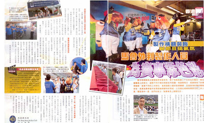
HKJC advertorial

Image
The prime objective of any corporate communications initiative is to establish favourable reputation with the public. HKJC is in gaming business which is prone to corporate image problems and public criticism. Its image risk increases since it has been allowed to advertise in the broadcast media on a regulated basis so that it can combat against its competitors, illegal bookmakers. It has become a balancing act between revenue and image protection. In recent years, HKJC has therefore increase effort on trumpeting about its values to the society. It supports numerous charitable organizations, subsidizes public facilities and creates job opportunities directly and indirectly. In fact, some of the corporate communications inititaives are quite good. We can learn from them and steal some ideas.