Posts

Showing posts from June, 2008

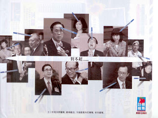
Apple Daily print ad
Image
It's holiday eve today. Just don't want to write too much. Here is an interesting ad for sharing. Enjoy ! Daily post resumes on July 2. Have a good holiday.

小林吸汗貼

Image
This product concept is pretty simple : a napkin under the armpits. Will it sell ? Maybe. It depends on the communications strategy. In this case, the major concern of consumer is whether this napkin can be seen by others and that's why it stresses on the 1 mm thickness. However the risk is there to many consumers and thickness may not be the selling point to compete with antiperspirants or deodorants that serves the same purpose. In fact, if we recognize antiperspirants and deodorants are competitors (the frame of reference), we can search and highlight what are more superior as the selling points. According to some scientific researches, certain chemical ingredients in antiperspirants and deodorants are potentially harmful. Can we leverage on these to position this product as a more "natural" alternative ?

3 3.0 TVC

Image
This new TVC of 3 is not too creartive but we can still hear the message loud and clear. "Telecommunication has entered into the 3.0 generation." It sounds like something big in the saying but what is 3.0 generation ? It doesn't really tell except that the tag-on tells some clues. The tag-on talks about its 23 TV channels and new Samsung phones. Is that the so-called 3.0 generation all about ? 23 TV channels or new Samsung phones is a not big deal to us. Are there more exciting services coming with it ? If there are too many to explain in a 30-second TVC, it could have highlighted its website address for people to check out more. I have checked. It's a disappointment.

Cathay Pacific business class TVC

Image
I taught a class in May and a group of students picked this TVC for their group assignment. They are supposed to make comments about the ad and suggest possible improvements to it. The fact is this ad is a home run in terms of execution and message delivery. The ad starts with minimal music to catch our attention. Then the music builds up with the visual up to a dramatic climax where this executive wants get away from the hecticness. The pay-off is the warm caring face of the hostess and the comfy flat bed seat. A simple execution but we can still see the production value of it. Bravo.

Colgate TVC

Image
Professionals like medical doctors, dentists, lawyers and so on are not supposed to endorse any commercial products. There are rules set by their respective professional associations. Then why we keep on seeing dentists endorsing toothpastes in TVCs like this Colgate one ? Simple trick to get around it : shoot the TVC elsewhere, somewhere doctors are allowed to appear in commercials or even endorse products. You can even save some production money by airing it regionally in different countries. Not a bad idea at all.

Wing Wah snowy mooncake TVC

Image
I bet this is the very first mooncake ad we see this year. Mid-Autumn festival is in September but mooncake brands are advertising early in order to get first mover advantage. In this case, Wing Wah is advertising about its snowy mooncake range. Be it the products or the colour treatment and the style of the ad, doesn't it look like a 大班冰皮月餅 ad ? It seems that Wing Wah is trying to get a good share of the growing snowy mooncake market with an early kick off. There is nothing wrong with that. However, it could have worked harder on the product and and image differentiations.

Calbee promotion ad

Image
Euro2008 is on. It's logical for a snack to do promotion at this time. Since Calbee is not a sponsor of the event, it can only say "脆味支持體育盛事" to get the association. Funny enough, not all the prizes in the promotion are soccer-related. Would it be better if they are, for better association ? Moreover the promotion lasts from May 26 to Aug 17 for almost 3 month, giving out different prizes by stage. Have done this kind of stage-by-stage promotion before and in my experience, not too many consumers are not motivated to participate into all stages, except a handful of "professional promotion participants".

Tao Heung print ad

Image
I have to agree that this cartoon illustration style makes the ads of Tao Heung stand out among other Chinese restaurant ads. With the funny cartoon character, we can easily identify with the brand. This ad carries a catchy headline too : "天子吃飯, 與庶民同價". But it turns out to be a disappointment as the menu is not exciting at all and it has nothing to do with the headline except the attractive price. It's just a nice dress up for a generic menu. Too bad, it could have done better than that.

Maxims MX print ad

Image
Pork chop with rice is the flagship dish of Cafe De Coral for ages. Once in a while, Fairwood promoted the same thing to compete with Cafe De Coral and now it's Maxims Mx's turn. Marketing is not about "人有我有" but differentiation. Cafe De Coral already has the franchise of this dish in the mind of the consumers. It's not easy to challenge that, not even with the endorsement of Suzi Wong. Speaking of Suzi Wong, she has become a hot celebrity for many brands. It's an interesting phenomenon. When a celebrity gets popular, too many companies/brands use the same person. At the end, no one remembers what she/he advertise for.

Mannings TVC

Image
Over the past 2 years, Mannings has been using different celebrities in its TVC : 馮德倫, 歐陽震華 and now 農夫. In each TVC, the message is different. It talks about "surprise" in one and "growing up with you" in another. Now it's talking about "confidence" in this latest one. Since different celebrities are used each time, there is no consistency in terms of tone and manner too. I wonder whether it is working on some kind of trial and error, searching for the right positioning and advertising strategies. Change of management ? Change of agency ? Perhaps.

Manhattan card copies

Image
Just received my new Manhattan card. You must check out the Chinese instructions (by clicking the image for a larger view). I though banks always use proper writing in customer communications. But to my surprise, Manhattan uses Cantonese writing in this one. I can guess it is trying to use the more approachable language to speak with its younger cardholders. The trouble is whether all its cardholders can understand this kind of Cantonese writing. I bet there are non-Cantonese speaking cardholders, like Taiwanese and people from Mainland China, who would not be able to tell what it is talking about ...

Pedigree print ad

Image
See if you buy this way of selling pet food. It comes from the insight that most pet owners are not home most of the time and the doggies will be bored and mess around at home. Probably that's a real problem. But can a pet food be the solution ? Look at the copies. Omega 3, L-carnitine, etc, none of them are not actually helping to solve the problem. The link is weak. Well, perhaps the only solution are training and Filipino maid.

Qantas print ad

Image
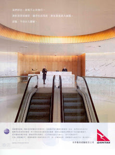
Guess what it is advertising about ? The first class lounge of Qantas. In the copies, it talks about great food, spa, comfort and so on but the visual is just a shot of the reception. Since it's about its first class lounge, should it work harder to express the prestige and the luxury at least ? Worse still, make another guess on where I found this ad ? Next Magazine ! Oh yes, what a great choice. There are like 0.00001% of the readers who can afford travelling on first class.

Fairwood TVC

Image
I wasn't paying attention when this TVC was on but I fell from the chair when I heard this line "點都唔落味精系列". This specific series has no MSG added. Literally it admits that its other foods are added with MSG. What of kind of silly concept is that ? Was someone sleeping when he/she approved this ? I'm scratching my head...

HK Broadband

Image
This new ad of HK Broadband is not funny at all. It's like a summary of the elements from the previous TVCs . The only new thing is this band singing 豈有此理. What's the name of the band ? Guess most readers can't tell. The band is called Blue Jeans and 豈有此理 is one of their hits from the 80's (seems that they are having a come back lately). It's rather weird to me that it uses an old band as the target audience is just too young to know them. I also wonder why it needs a new TVC . Basically the message is the same as the previous ones and they are more funny and creative. I'd rather repeat them and supposedly they are not too worn out.

Horlicks with wheat germ

Image
Looks like this new Horlicks with wheat germ is targeting tea meal houses. Leveraging on the success of Ribena with lemon, GSK is trying to extend another product/usage to this channel. It's a logical thing to do and it also comes with consumer insights. Totally agree that foods at tea meal houses lack fibre and there is room for a healthy drink to fulfil the need of the health-conscious white collars. Haven't seen it yet tea meal house in my neighbourhood. Guess the sales people are working hard on those at the commercial districts. Would certainly give it a try. Anyone has tried it ? Is it any good ?

Carbonated Ribena

Image
Saw a student drinking this in class the other day. This new product is going against the current product trend in FMCG. First, it's non-returnable glass bottle. Doesn't sound too green. I guess there is an attempt to go with the same thinking as the small coke contour bottle, i.e. using the bottle as the brand mnemonic. However, too bad that the bottle shape design is kind of generic. Second, it was said that it contains no artificial sugar. While everyone is talking about calorie free with artificial sugars, somehow it's trying to stress original taste and hint artificial sugar is not a good thing. There are some interesting thoughts behind it indeed.

官燕棧雞精

Image
The major weakness that deters 雞精 from being more widely-accepted is its taste. The taste is so weird like water down soy sauce and oyster sauce combined. Good thinking to come up with a 雞精 that tastes better to challenge the leader, 白蘭氏. However I wouldn't have launched it under the brand name, 官燕棧. The name is too associative with 燕窩 and it doesn't give credibility for 雞精. I would either go for a new brand name or use endorsement branding, i.e. a new name endorsed by the mother brand. The mother brand become secondary and acts as a quality assurance to consumers.

Park'n Shop everyday low price TVC

Image
It is meant to be funny but it's lousy humour in fact. Yet another "歡樂今宵" ad. When Park'n Shop first advertised its low price, the Consumer Council coincidentally reported that the so called low prices at supermarket chains are not that low anyway, compared with other smaller shops. Negative publicity is still lingering. I wonder why it still advertises low price with this second TVC. Advertising lacks credibility and using it to fight against negative publicity is simply a dumb idea. At least, it should wait a longer while before a new campaign is launched.

Healthcare Reform TVC

Image
Your Health, Your Life. This is one of the best public affairs TVCs I have seen recently. Most ads from the government are quite boring lacking creativity with straight sell approach. The good thing about this one is that it uses a soccer game as the analogy to urge us to the involvement of the healthcare reform consultation. The copies are well-written and thanks to the participation of the officials into the act, it is a memorable TVC indeed. Well done.