Posts

Showing posts from July, 2008

EPS I DO x 貴仁 promotion

Image
The EPS I DO campaign is a CSR program where you spend with EPS and EPS will donate a small portion of your spending to plant trees in HK city. It's so strange that it uses the EPS I DO image of Wyman for a joint promotion with a watch company called 貴仁. The promotion has nothing to do with planting tree but it's about cake coupon giveaway upon purchase of HK$10,000 or above. HK$10,000 for a cake coupon ? That's not too attractive in any sense ...

Warwick Hotel print ad

Image
It's a dream comes true if you can have a private party with your good friends in a hotel. Targeting young consumers who may not be that rich, the ad tries to equate private parties at Warwick Hotel with private jet, expensive wine, sports car and so on. The idea is there but I wonder if it is relevant at all. I wonder if it should just simply say how affordable it is to have private parties at the hotel. After all, it's just a hotel in Cheung Chau.

MTR corporate TVC

Image
This could be the funniest corporate TVC I have ever seen. Corporate TVCs are usually boring with generic messages and uncreative executions as they target a broad audience. Humour is often avoided too. In corporate ads, you just want to project a more serious image about your company and you just can't be too funny. Yet when humour is carefully used, you will be able to lower the guard of the audience, increase the reception of the message and more importantly get the audience to remember it. The caring message of this ad is also generic but the humour get us to remember.

Bank of China Olympic themed corporate advertising

Image
The Olympics is round the corner and it's the hype for different advertisers to try to share a slice of association with it. Official sponsors make use of it to enhance their corporate image with corporate advertising. Non-sponsors also leverage on it with sports themes of some kind to do promotions and advertise. At the end, the name of the game is creativity and money if you really want to cut through the clutter. Back to this Olympic themed corporate TVC of BOC, the idea is simple : tying the milestones of the Olympics with those of the company. Isn't it a familiar idea ? For an ad like this, you'd better put enough money behind it for achieving cut-through.

California Red promotion

Image
This seems an interesting promotion idea. Work Hard Play Hard is the theme and it takes a segmentation approach to targeting different professions with different promotion mechanics. Check out its website . The first promotion targets people in the insurance industry with a singing competition. There will be more promotions addressing people in the telecommunications, tourism & hotel, property and retail industries. If it is able to come up with promotion mechanics that are really relevant to the people in the respective industries, it will be a successful promotion. It's not going to be easy though.

88DB.com online advertising

Image
88DB.com is a newly launched online advertising website for entrepreneurial start-ups and freelancers. It's branch out from JobsDB . I took a visit to the website and could not figure out how it can compete with other online advertising providers like Yahoo!, Yellow Pages and Google as a late comer. It's just like yet another host of online ads of everything without a clear positioning and target segment. Who should advertise on it ? Who would go the website to search for products and services ? What is the edge over other online advertising providers ? Looks like it won't be able to repeat the success of JobsDB .com which is one of the pioneers in online job board providing the most user-friendly functions to both employers and candidates.

Sealy advertorial

Image
Advertorial is advertising disguised as editorial. It is one of the most frequently used means of marketing communications. Advertorial contains long copies and high chance is consumers will skip it as they can tell it's actually advertising. In a way, it has become a self-indulging way of advertising. Advertisers feel that it's worth the money as they can put whatever they want in the two-page space. But what's the point if there is no one reading it ? Like Sealy in this case, there is room for a creative ad instead of an advertorial. Key message : comfortable mattress. Support : chosen by top resort hotels. And then we can leave it to creative people to come up with a creative ad to catch people's attention and send the message.

TVCs of P&G's shampoo brands

Image
Head & Shoulders and Rejoice are two of the many shampoo brands owned by P&G. And these two ads are on air recently at the same time. My problem is that they look so similar. It may be argued that the target audiences, messages and storylines are all different and it is alright to run them concurrently. That's only valid by the eyes of the marketers. Yet we are talking about average consumers who may not be able to tell which is which. There is a risk of having both ads diluting each other in terms of brand registration. Wouldn't it be much safer if they are run at different times ?

Pilot Frixion TVC

Image
Two thumbs up to this TVC. It's a brilliant ad that combines functional and emotional appeals tightly together. I just love this line : 睇得見, 擦得走, 總可以期待一個新開始 ! Erasable pen is not new but the ad really gives it a poetic meaning about its uses. I just have two questions. First, who is the agency ? Second, how many pens does it need to sell to justify the production and media ? I assume these pens are not too expensive and the market is not so big ... well maybe I shouldn't ask and just enjoy the ad...

Panadol pain relief patch

Image
Panadol launches a new pain relief patch. 必理痛 stands for pain relief as a brand. It's quite logical to stick with the known pain relief positioning to extend products from internal intake to external application, thus providing a holistic range of pain relief products to consumers. With regard to the TVC, my comment is that it's just too similar to its other pain killer TVCs. It should deserve an ad that looks more different in order to make consumers notice that it's a new and different product from the Panadol they know. Also more explanation may be needed to elaborate on the action and benefits of the so called "藥用成份" as it seems to be the key differentiation from other pain relief patches.

Sharp Aquos TVC

Image
I wouldn't say this is not a creative and funny TVC. Just that the idea is way too complicated to be appreciated. It uses the pimple of the extra acting black pepper as the subject matter to tell us how fine the image of this HD TV is. Probably there could be other subject matters that are funny and easier to understand. What's more, it gives me a feeling of racist in a way. So I guess I would only take this creative only if you point a gun at my head ....

Dr. Alice print ad

Image
Ads are meant to sell. Yet we need to be tasteful. "讓妳做一個令男人雙手握不住的女人", I bursted into laughter when I saw this line. It's can be treated as a joke in advertising. And I wonder what 楊思琦 thinks when see this ad. Does she agree she is a 令男人雙手握不住的女人 ?Sorry I just can't help laughing... If we ever have a joke book about ridiculous ads of HK, many of these beauty and slimming house ads should be in it.

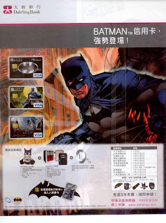
Dai Sing Batman credit card

Image
Dah Sing is the most active bank in coming up with cartoon/comic character credit cards. Every launch is pretty much the same with some premiums of the character as welcome gifts. It may be a good acquisition initiative to turn fans of a particular character into its credit card customers. However, the problem lies with how to encourage the customers to spend more with the character card. Unlike other co-branded cards like Citibank/I.T. card offering discount at I.T., character card doesn't really tie with any channel of spending or any long-term benefit for using it. Without those, it's just a credit card for the fans to keep safely in their drawers.

Trappist Dairy soy milk

Image
Brand building takes two legs : consistent and continuous investment in marketing communications and a constant flow of new products that match the changing needs of the consumers. Dated, forgotten brands often fall short of these two important drivers. Trappist is a brand of locally produced fresh milk but it's losing its position in the mind of the consumer. Recently some new product launches are observed including new flavours and this soy milk range. It's all too late. Not only non-genetically modified soy milk is nothing new under the sun but also a mismatch with what the brand stands for.

Sony Ericsson TVC

Image
Undoubtedly, this is a brilliant TVC. It must be a regional or even global production. The creative idea is simple. A surreal demonstration of the handset : capture, send and share anytime anywhere. Such benefit message is supported by 3 features, namely face detection, auto-focus and 5.0 mega pixels. If you pay attention to the model name, you would be aware that this model is called C902 Cybershot. Yes it uses Cybershot's brand franchise of Sony in digital camera to brand this particular model. The intention is to associate it with the quality of Sony Cybershot DCs. A great branding strategy.

HKJC Equestrian TVC

Image
Here is another corporate TVC with the Olympic Equestrian event as the subject. HKJC is the major contributor of the event. This message is well supported by the fact that it builds the venue, the green thinking behind it and the participation by the local sportsmen. It's not a very creative ad per se but everything is there and the message is pretty clear. One small comment though : branding can be improved as there is just a end super appearing for one or two seconds. If people miss that, the message is missed.

Midland TVC

Image
The Olympics is round the corner and many advertisers are trying to get some associations with the big event. The images of this Midland's TVC are intended to associate with the Olympic Equestrian event to be held in Hong Kong, With the Unicorn leading the way, it attempts to project a leadership image. Yet, doesn't the whole ad look very familiar ? I bet no one will really remember this ad as the images are so generic. In comparison, the corporate TVC of Centaline is better in terms of idea and execution.

Kingston promotion ad

Image
If you really want consumers to read your ad, don't manage it like this one. There are just too many colours and too many different kinds of fonts. It may be attention getting but I guess no reader would read the copies with such a dizzy execution. Clean and tidy is the key. We need a main visual that catches readers' eyes and interests them to read on.

Tao Ti red oolong print ad

Image
Tao Ti is not a brand with long history. It was first launched in 1996. Compared with other FMCG brands, it's still a "youngster". Brands come and go. Sustaining a brand for 12 years is not easy . Making it stronger over time is an uphill battle. Why is Tao Ti so successful ? I can't be sure but as an observer, I appreciate it for two things. First, consistency in advertising : Andy Lau + his soothing songs + the natural setting. Second, a continuous flow of innovative products, tea products and nothing else. There are 500-page textbooks about brand building but consistency and focus are the two key success factors.

Citifinancial TVC

Image
Here is the second Citifinancial's TVC of the campaign I talked about in my previous post. Playing with secondary school chemistry and physics in a lab setting, it's quite a creative attempt. Obviously this second one is stronger and easier to understand than the first one. It's a typical situation we are faced with when we manage a campaign with different ads sharing the same platform. One bounds to be stronger or better than another. The more ads you produce within a campaign, the more likely for this to happen. Literally there is no solution to it except producing fewer.

PPS TVC

Image
Needless to say, this TVC targets the younger generation. The objective is obvious : expanding the user base. Heavy users of PPS should be more mature like aged 30+ as they have more bills to pay. Within this group, those who use it have been using it and further penetration is getting more difficult. The younger generation may not have that many transactions and the bill size is smaller. Yet, it is hoped that they get used to this method of payment and carry on using PPS as a habit when they grow older and have more bigger bills to pay. I think it's the long-term marketing strategy behind this campaign.