Posts

Showing posts from September, 2008

Anti pathological gambling TVC

Image
Hong Kong Jockey Club promotes its gaming services and pay tax to the government. And the the government spends part of it to help people suffering from pathological gambling. Isn't that kind of ironic ? Anyway, this TVC is pretty well done indeed, not only compared with other public affairs ads but also ads from commercial organizations. 賭到眾叛親離, 你輸得起嗎?It's really quite a strike on the head.

Disneyland Halloween TVC

Image
In terms of creativity, the Ocean Park Halloween TVC wins by far. In terms of strategy, Disneyland also loses. I really wonder why Disneyland will pick Halloween to go head on with Ocean Park in the first place as Halloween is owned by Ocean Park. If it really so decides to go head on, at least it should work on some differentiations. Perhaps, different target segment : family rather than youngsters. Perhaps, scary Mickey Mouse rather than me-too with Ocean Park. Its TVC will only remind people to go to Ocean Park ...

Ocean Park Halloween Bash TVC

Image
Poeple like complaining nowadays and censorship is getting tighter and tighter. As a result, there are more safe and boring ads on TV. What do advertisers do ? Advertise elsewhere. It has become a standard act to come up with a safe/shorter ad for TV and then another longer uncensored version for broadcasting somewhere on the web like the You-Tube. I'm pretty sure this ad is posted by Ocean Park and best of all, it's free and targeting the young audience. Coupled with the TVC, there is a game application on Facebook too. Along the way, TV advertising may be having a less important role in a communication mix over time. Cost and censorship will kill it.

Corning Kitchenware advertorial

Image
It's the same Corning Kitchenware that we all know for ages. Nothing is changed in terms of features and attributes. The challenge is to give it some more reasons for purchase. Then the marketer tries hard to think of some selling points. In this case, we have healthy, energy saving(anti-inflation) and green. Sounds so magical. Just go into the copies and you would feel the same that the claims lack relevance. Also, 袁詠儀 is not adding value at all ...

Vita Ceylon Lemon Tea

Image
Vita has just launched a new variant of lemon tea called 維他錫籣檸檬茶. Is this an extension or a replacement for the existing 維他檸檬茶 ? If it's an extension, the packaging design is so similar to the original variant. Consumers will be confused. And if it's a replacement, should we really implement it in one go in order to avoid the confusion ? I guess there must be some kind of management dilemma going on ....

Some interesting outdoor ads

Image
Thanks to one of my friends who sent me these, I can write something else other than the recent boring ads. Outdoor is a difficult vehicle to use. Audience do not have too much time to see and digest your message. So visual is everything. If you can ever be so creative like those below, there will be an added benefits of publicity too. Let's go crazier when it comes to outdoor.

Acomplia print ad

Image
It's not easy to advertise a prescription drug. There are rules to follow and we can't be too explicit. We can tell from this ad that this drug is for 中央肥胖 but the trouble is that one wouldn't know what CB1受體阻斷劑 is if he/she doesn't have such problem. The fundamental issue is about the role of adverting in selling drugs. I would rather save the money and invest more on PR and communications at the ethical channels. Advertising is not a must in a communications mix ...

Listerine TVC

Image
Compared with banking and finance, marketers of FMCG have an easier life in communicating about their products. FMCG products are usually simpler with more single-minded propositions. Here is a classic example. It's a simple analogy : Listerine is like sea waves that get rid of the bacterias causing plague. Not too creative, one would comment. But it serves its purpose of communicating the product benefit and it's much better than many other ads already. Also, try turning off the sound. It can still sell. That's what a qualified ad should be like.

Standard Chartered Click-a-Count

Image
Concurrent with the Citibank Octopus card that I talked about yesterday, Standard Chartered also launches a so called Click-a-Count. It's another integration idea of earning rewards through different payments and transactions. Since the product idea is so complicated, it's so difficult to explain it in a 30-second TVC . After watching this TVC , could you understand what exactly it is about ? You may figure it out by visiting the website . You can only explain it in more details in a 2-minute ad ... The TVC can only bring up the awareness and interest at best and hopefully people will check it out in other communication channels for details.

Citibank Octopus credit card TVC

Image
Citibank has just launched a co-brand card with Octopus. It's such a logical combination of both payment methods and it sounds so convenient to use the rebates by Octopus from the credit card spending. As for the TVC , the style of execution has somehow masked up the storyline which is supposed to explain the benefit of the card. You will just need to pay full attention to the ad to tell what is happening. Trouble is consumers seldom sit tight and watch an overloaded ad.

Bupa TVC

Image
At last here is a good TVC to talk about. I like humour in advertising. When the audience laugh and smile with an ad, their mental barrier is lowered and the reception of message is higher. Humour is also about idea. When the idea is great, it won't cost you an arm and a leg to produce an appealing ad. It's simple mathematics. You save the money in production and put it back to media, making more people get your message. Don't spend your ad money on celebrity. Spend it on paying a good agency for an idea !

Happy mid-autumn long weekend

Image
Daily post resumes on Sep 16 (Tue). Enjoy your long weekend.

Esso promotion ad

Image
This is quite a funny promotion. We are suffering from high inflation and the prices of the necessities like rice, cooking oil and so on are on the rise. I guess this is where the promotion idea comes from : redeeming for goods that people really need. However, gas price is on the rise too and car is not a necessity in HK. People will drive less and how would they be able to redeem these goods ? It's ironic in a way.

稻香月餅 print ad

Image
Various brands of mooncake are cutting new product gimmicks and going back to the basics with image ads about family reunion. 稻香 is doing pretty much the same thing. It's a relatively late comer to the mooncake market and one may argue that it hasn't got the same long history as brands like 榮華 and 奇華 have and it's not really up to it to own "tradition". But when I look at the ad, somehow it can give tradition a new look and feel with its funny cartoon illustrations. It's a nice try. At least it gets us to remember. Hope this will appeal to the young and the old.

St. Honore TVC

Image
Over the years, different bakeries barnds had been competing on new product innovations during the mid-autumn festival. Some of them just sound disgusting and it seems that they are invented just for teh sake of gimmick. Although there are some new products like cheese + caviar and cheese + truffle (yuck ! Can't remember which brand they are from), there are more image ads this year. However, as a consumer myself, I am confused with which brand is which brand since they all have night scenes and warm jingles like this one from St. Honore ...

Panasonic Lumix TVC

Image
Hi-tech product markets like mobile phone and digital camera are so dynamic. New technologies and new products are launched everyday and every brand tries to compete with new features and functions. Like the face dectection function of digital camera, it was first launched by Canon. And now there is a more advanced version of such function by Panasonic -auto focus tracking. The TVC is a straight demonstration of the function. It's quite amazing. Yet, I think it can be better done if we consider who this function would really appeal to. Would it be parents wanting to take shots of kids playing ? Or pet owners trying to take shots of their pet which always moving around ? Product demonstration is alright but we need to fit the product into some relevant situations depending on the target audiences.

Epson vs Sanyo LCD projector

Image
How long does it take for a common LCD projector to start up ? 30 seconds ? 60 seconds ? This new Epson LCD project can start in just 5 seconds. It may be a unique feature but not necessarily a unique selling point. Unique selling point has to really sell in the first place. Do consumers care ? As for Sanyo, it trumpets about being the world's smallest and lightest. That's more like an appeal, particularly for those who need to travel around making presentations. However, the ad execution is not well thought-out. It's quite straightforward to use book as the analogy. Wait, the product is white and the books are white. Both are placed on a light background. Are we playing photo-hunt ?

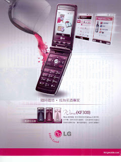
LG Wine KF300

Image
Here is a mobile phone that comes with a wine dictionary. and now you can become a wine expert. It's quite a niche selling point. Really don't know how many will be sold. Other than the iPhone 3G, it seems there aren't too many exciting phone launches recently. Are the big brands holding back new phone launches to avoid clashing with the iPhone ? What will be the next hype ? Nokia, Sony Ericsson, Motorola, we are waiting.

Pocari Sweat

Image
Pocari is an isotonic drink like Gatorade and Powerade. In the past it had a head-on positioning with the other two brands with strong association with sports. Over the years, it has managed to retain its re-hydration benefit in the mind of the consumer and evolved into more like a lifestyle brand and it is now associated with funs under the sun rather than serious athletic sports. It has become one of its kind. But strange that Gatorade and Powerade are so quiet these days. Is sports drink market so small that it’s not worth the investment in promotion ? There may be room for rebuilding a brand in a niche market I think.

李萬山整腸丸TVC

Image
How about a sexy and modern ad for an old brand ? I find it quite interesting to see the rather old logo and packaging in such a modern setting. History and heritage are important in selling traditional Chinese medicines. Yet these brand elements need to be kept up-to-date so that the younger generation will not be felt alienated. As for the TVC, it's so similar to the Salonpas one below. It's almost a copycat. If the client really watched some TV, they should have killed it !

散利痛

Image
散利痛 and 必理痛 are the first two branded pain-killers that appeared in the market at about the same time many years ago. They are the winners in brand naming as both are strongly associated with the product benefits consumers look for. However, 散利痛 has been losing out in term of brand salience. Usually a brand becomes weak due to two major reasons. First., lack of consistent and continuous investment in marketing communications. Second, no new news when it comes to product innovations. 散利痛 is an exact example when you compare it with 必理痛. Will it be easy to turn it around ? No. At least not just with a half-page ad like this.