Posts

Showing posts from January, 2007

Alene promotion

Image
A promotion ad from Anlene. It's a lucky draw for a table of 新春鮑翅宴. The mechanics is not really related with calcium milk powder but we need to give credit to their agency who manages to come up with an interesting ad. A pile of tea cups to depict a healthy spine to associate with the product benefit. Very clever indeed. The client is lucky to have a clever agency. Otherwise, what you get is a boring ad for such a 無厘頭 promotion that has nothing to do with the product.

Sato 鼻寧

Image
An ad from a small brand but it's quite creative. I'm sure if you have nasal allergy, you would definitely be able to identify yourself with what it's talking about. Even if you are not a sufferer, it still manages to catch your attention. A good example of strong visual and clean & tidy layout. I guess it's not done by one of the 4As as probably such a small brand can't afford it. So there must be some smaller cost-effective agencies out there. But it's not easy to find one ...

太興燒味餐廳

Image
太興燒味餐廳 recently advertises on TV and prints to promote their roast goose. One of my students comments that the ad is not too tasteful because of the association with Swan Lake, the ballet, to sell roast goose. Anyway, according to my observation, the promotion manages to boost sales and I see queues during lunch and their restaurants are pretty filled during afternoon tea time too. Is that because of good advertising ? Partly. It's also the strategy. By its name,太興燒味餐廳, this restaurant chain have already positioned itself as a 燒味 specialist and they just use roast goose as the anchor product to boost its specialist image. So as a strategy, it doesn't matter of they promote their 燒肉, 叉燒 or 燒鵝 so long as the anchor product help to boosts its 燒味 brand image.

Slimtech 減肥堂

Image
Speaking of dying category, here is an ad from 減肥堂 and it shows how people struggle in a category that has already lost its credibility. The ad tries to ride on the negative news about the malpractice of other sliming houses in order to promote their quality image. There are ISO quality shields, good package price and celebrity endorsement in the ad. They may be proper business people with integrity. But will a single ad like this turn around the negative image ? Probably not. The ad with a re-touched celebrity image just makes them look like any other slimming houses.

當代書院

Image
In face of fierce competition, there are usually two things poeple will do. First slash the prices. The effect : price competition drags everyone down making the category unprofitable. Second air some eye-opening advertising with silly execution and misleading claims. The effect : consumers' mistrust and negativity prevails and the category is killed. Slimming houses, Lingzhi products and here tutor schools. When you see this kind of ads, it's about time.

Healthworks Lingzhi drink

Image
A new product from Healthworks. A Lingzhi drink. Obviously the intention is to ride on the wave of Lingzhi health supplements. Will it sell ? Let's do a little analysis. Lingzhi health supplements are sold at around HK$400-500 a box. They spend big bugs on advertising and celebrities to brainwash consumers that "effective" Lingzhi products should cost us that much. Now this is a Lingzhi drink that costs HK$8-10 (?). Would consumers believe it has real health benefits ? If it does sell, it is just a good-tasting drink that quench the thirst.

MTR Hello Kitty Dream Wedding

Image
Hello Kitty again ... guess I should have a separate section to store all the Hello Kitty promotion ads ... This ad is like a recruitment ad for a PR event by MTR. By submitting a MTR love story of yours, you can get a chance to have a Hello Kitty dream wedding and Hello Kitty and Dear Daniel will be your bridesmaid and best man. If you are one of the fans, I guess this could be the ultimate experience of your lifetime. Since this a MTR promotion, I wonder why they don't do it with Disneyland. We would all think that MTR and Disneyland are more strategically related. But this is the reality : Hello Kitty are more popular than Mickey.

Huggies TVC

Image
This is a very cute TVC. Guess you would love it as I do. I appraciate it as it focuses on sending one single-minded message : Huggies = happy babies ... you never know whether babies are happier wearing Pampers ... that's why it takes an ad to appeal to the parents. The scenarios in the ads are associative with what the adults call a "typical" bad day. Relevance and single-mindedness are the two important elements of a brilliant ad.

Vono Mattress

Image
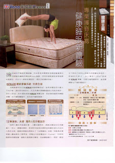
Speaking of mattress, Chinese New year is round the corner and it's the peak season for the selling furnitures. Vono, you may not have heard of this brand of Mattress. But you must have heard of Slumberland. Vono is in fact a lower range of mattresses produced in the same plants with similar technologies as Slumberland. So in a way, it's a poor-man Slumberland like Rolex vs Tudor. Different positioning, different brand and this is how we can avoid dilution of our core brand. The last thing we want to have is a brand that represents high price, low price, high-tech, low-tech, for kids, for adults, for the rich, for the poor, all at the same time. Don't have the money to start another brand ? That's your problem. Using your premium brand to sell lower-range products may be profitable in the short-run but it's a strategy proven unprofitable in the long-run.

Kowloon Dairy consumer promotion

Image
The thinking behind this consumer promotion is perfectly logical : Drink some hot milk before bedtime and have a sweet dream. It's a good usage entry point particularly during the cold winter. It's also a good thinking to give away mattress as the prize of the consumer promotion. But the ad is a failure. Just at a glance, I thought it was a Simmons Mattress ad as it is very weak in branding. By branding, it doesn't mean we have to put up a huge product shot or prominent logo (although sometimes it does help). In this particular ad, it might have worked if the cow is a recognized icon or mascot that represents the brand. Like the classics, say, the tiger of Kellog's, Mr. Peanut of Planters, the Green Giant and so on. But that cow image is not "owned" by Kowloon Dairy and that's why we can't readily tell it is one of their promotions.

Nikko sportswear

Image
Speaking of sportswear, Nikko is another dated brand (don't pretend, you are old enough to have heard of this brand). Why ? You can tell simply from their ad - a very traditional way of selling : products as the heroes, captions to explain the functions and merits of each product plus a meant-to-be catchy headline. All these might have worked 20 year ago but now that sportswear is a kind of fashion selling on emotional appeals. How many real skiers are there in HK after all ? 100,000 ? People look for style and image rather than caring about whether it keeps them warm or not. Nike knows that and that's why it's a multi-billion dollar brand.

Lafuma ads

Image
One brand. Two ads sharing a similar idea. I talked about the one above before . Which one is stronger ? They look similar visually but are they really the same ? No. The one above represents a bigger idea : "unzipping" the challenge. Such a big idea is lost in the second ad on the left. Big ideas are hard to get. It takes some kind of envisioning to make a big idea campaignable. It's a disappointment in this case. How can we envision and manage campaignability ? See more. Think more. There is no other way. Advertising : be a regular reader of my blog !

McDonald's Soft-Hard promotion

Image
Seems that people is breaking away from the curse of Hello Kitty in consumer promotion. McDonald's is taking the lead by employing Soft-Hard and their merchandise. The year of pig is round the corner and McDonald's promotion is well strategized to ride on the feative season. First, they lauched a new product : the Grilled Curry Pork Burger featuring Soft-Hard. Then here comes a redemption promotion of Soft-Hard soft toys "Properity Pals", each coming with 蘇民峰豬年運程 ! Isn't that a good promotion strategy or what ?

Samsung x Le Petit Prince

Image
Maybe you have also noticed that there are quite a few Little Prince promotions lately. This is just one of them. Looks like their licensing agent is doing their job. Will he get a wide popularity ? Like Hello Kitty ? Little Prince is a already 60 years old. It comes from a French novel/children's book translated into 150 languages. It makes several profound and idealistic points about life and love and the simple truth that people seem to forget as they grow older. He carries deeper meanings than Hello Kitty which only sells on its pretty image. But in the shallow culture of HK, Hello Kitty wins and I bet Little Prince won't be able to go into the mainstream.

justgold

Image
justgold is a brilliant brand name. It tells us right to our face what they sell, just gold, nothing else. How do we come up with a good brand name ? First we need to have a positioning and positioning is about focus, the key to building a share in the mind of consumer. Want to sell diamonds ? The merit of this justXXX naming structure is extendability : justdiamond. The extension can be limitless : justsilver, just crystal, justjade ... you name it so long as it is jewelry business targeting at women. But the trouble is that such a highly extendable structure is easy to become generic. Other people may come up with brand names like justcoffee, justcandy, justfashion and alike diluting your brands. Well, brand naming is an art and it's not easy at all.

創興銀行

Image
廖創興銀行 has been rebranded to 創興銀行. The intention is obvious : to erase the family image of the bank. 「新形象‧新里程」is the slogan but the TVC doesn't look too new and creative to match the claim. It's just like any other coporate ads that talk to themselves. And a slogan remains a slogan if we fail to the consumer question "how does the change of name benefit me ?" Hopefully we will see more of their effort that make us feel they are different in terms of products and services.

Ambi Pur print ad

Image
Some products are inherently more difficult to sell. "Selling smell" in print or other broadcast media is not easy as it is almost impossible to describe a fragrance exactly by words and visuals. If you have the money as the perfume people do, you can sell image, lifestyle or attitude on TV using pretty models, powerful music and fancy scenes. But what do you do if you are to sell a more down-to-earth air-freshener that costs only HK$20 ? In this ad, rainbow is taken to associate with the nice smell. It's not creative but let's not be too critical for a change. It's not easy. But come to think of it, should we do print ad in the first place ? Maybe a good sampling program or setting up product demonstrations at retail outlets will be more effective with a limited budget.

笑傲江湖

Image
This ad has been sitting in my file for a while. Time to pick it up and talk about it for good learning. Poeple in the entertainment may not be good at advertising but they are just great in PR. As marketers in consumer goods and services, there are many things that we can learn from them in marketing. A 笑傲江湖 drama. How to make it attractive while many versions of it has been run for thousands of times ? Give the "product" a twist : putting 2R sisters into the cast. Create a PR angle : shaving the head of Race. Generate publicity : media interviews with the press and different media. Everything is well calculated for creating the buzz, newsworthiness and talk-abouts. Something we have to learn indeed.

Hitachi Corporate Ad

Image
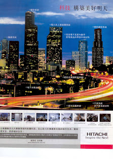
This is a coporate ad from Hitachi. It's not too creative and you must have missed it. As being a corporate ad, it can't be too creative anyway. Usually corporate ad is the kind of ad that talks to everyone. How creative can it be ? I'm not a big fan of coporate advertsing. I kind of believe that coporate image should be built through its products and services and PR. Advertising isn't the right kind of communication vehicle. But why people still use advertising ? In way management always want to fulfill some sort of corporate ego and make themeselves feel good. Like this one, Hitachi is trying to tell us that they are contributing to the future of the society in many aspects with their technologies. LG, Samsung, Sony, HSBC and Mr. Li Ka Shing are all saying they are doing that. So what ?

CASH ad

Image
Advertising an advertising ! This is something really new ! CASH has just launched this print ad to announce they have wrapped a MTR train with advertising and this train is running on the Island Line transporting millions of HK people ... blah blah blah ... big deal but how does it benefit me ? None, they reckon. So they add a consumer promotion giving away ... guess what ? MTR tickets, of course. Two thumbs up for such a bright idea.

About Beauty

Image
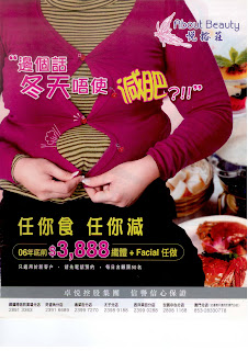
任你食, 任你減 ! The slimming house market is flooded with this kind of over-claims. Who would still believe that these days ? There are no more silly consumers on earth would believe such a fallacy. I'm sure that the slimming house market has shrunk a lot. Ironically it is the marketers who kill the category. There are definitely consumer demands for weight control and if everyone played by ethics and professionalism, there would be positive and healthy market. Now that the category has been killed. It's sad and it's particularly sad for those practitioners who really provide professional services and advices on proper exercises and dietary control for weight management. They are also drowned in the muddy water.

Sun Life Financial

Image
Speaking of positioning strategy, positioning against competitors can also be effective in building an positive impression in the minds of consumers. This ad is not a new one but a good example. While other are confusing people with jargons and complex calculations in financial planning, Sun Life Financial position themselves as the real professional who explains everything without any hidden details. The proposition is great and compelling but it's a brand promise too. Advertising is just one element in the overall marketing communications. We need to manage all the touch points that are in touch with our prospects and customers to deliver the promise. One important touch point is their financial planners and there are like hundreds of them out there. It's not easy manage every one of them to deliver such a brand promise. It would take a lot of training, brainwashing and change management as well. One single positioning can potentially affect how many people do their jobs in a

Yahoo! Store

Image
Yahoo! has launched a new e-store platform for auctioning. Stemming from the "normal" auctioning, it's an added platform for those people who are willing to pay a bit more for added services to do their trades better. Logically the strategy is to position it against leasing of traditional physical stores. The ad says it all with a simple creative. A good example that if we are able to position our products and services clearly in a focussed manner, our ads can be more easily done nicely to convey a single-minded message.

Pink Magic

Image
Is there a market for this kind of thing ? Something that turns/keeps your lips and nipples pink. This is the 2nd or 3rd campaign and they are really putting quite a bit of money to promote it. This time a double-page spread with an ad and an advertorial coverage of event/testimonial is used. No complaint about the ad and it's quite clever by using a Greek sculpture to demonstrate the effects of the product. As for the advertorial, you see a coverage of an event riding on the same of concept of demonstration : the product is being applied to the nipples of a full-naked male model. The model looks quite 無奈 in a professional way. And look at the faces of the women, they are obviously enjoying the wicked act. 小姐, 喂好痕呀 ! 唉, 真係揾食艱難 !

Mirama Shopping Centre

Image
Keep eyes open is headline. Definitely your eyes turn wide open when you see this ad of Mirama Shopping Centre. An eye-ball in the mouth. I always try to keep an open mind but this is just too scary. You may say it's a visual art and yes it's a visual art for selling a horror movie. Imagine what if we turn this visual into a poster and hang it over the shopping centre. We can turn the shopping centre into a house of horror. Halloween is still another ten months away !

iXpress Credit Card

Image
This is an interesting credit card idea : you can make your own card credit with a photo of your choice. Such idea can be creative enough as an acquisition gimmick to attract a big consumers base. However, in the ad a golfer scenarios is taken and I wonder why. Maybe the boss of the company is a golfing fan and the agency is trying to please him/her. There are just many more scenarios that can be used for relevance sake, depending on who we want to sell to. For e.g., family photo is more relevant. Yes it could be boring but at least people can relate to. Like in real life, your friends often show you the pictures of their daughters and sons and people do keep photos of their family in their wallets. It could be a better consumer insight to sell this credit card.