Posts

Showing posts from March, 2007

H&M

Image
Been to H&M ? It's the talk of the town, a must-go. If you drop by H&M, I bet you will still see long queues in front of it. It's definitely a hype created by a good blend of marketing : clever use of celebrity, attractive pricing, PR, and (outdoor) advertising. The whole buzz is created around Madonna where the attraction is that you can buy the clothes she wears at affordable prices. In fact the store has another selling point about its product management. I read an article about its concept of "fast fashion", i.e. each design is produced in small batch so that it goes fast and new designs can hit the store much faster. This concept adds to costs and it's not easy to manage but it's a remarkable benefit to consumers. An example of success with powerful marketing mix.

Coke Zero

Image
I really don't understand the rationale behind this brand extension. Yes it's loud and clear that it contains zero calorie. And we know Coke Light contains 1 calorie that is easy to burn it off. So in terms of calorie intake, there is literally no difference. As a naive consumer, I would assume Coke Zero and Coke Light are the same. But what interest me would be the taste differences among Coke, Coke Light and Coke Zero. The taste of Coke Zero is said to be the same as the regular Coke : same-taste-low-calorie for Coke Light and now same-taste-no-calorie for Coke Zero. Well, you will have to find it out yourself. If you like it, you switch from Coke Light to Coke Zero. If you dislike it, you just stick with Coke Light. So 'why Coke Zero ?

AMEX promotion ads

Image
It's not easy to come up with creative ads for credit card promotion. Usually we see a lot of straightforward ads with offer simply put upfront as the key visual. Here both ads are from the same series. One is about winning a trip to Sydney. The other is about restaurant discounts. The Sydney is simple with a good touch and easy to understand. The restaurant one is not so easy. The trouble is I can't figure what it is on the plate. Can anyone help ?

Olympus print ad

Image
I bet the digital camera market is getting more saturated like mobile phone. Like myself, I have had 4 digital cameras before and two of them are still with me. In a competitive saturated market, you will be aware that competition is getting more marginalized and trivialized. Take this u760 print ad of Olympus as an example. They are just selling the availability of 3 different colours. You would appreciate why they do that. While all manufacturers are capable of matching technologies with one another like pixel resolution, anti-shock, optical/digital zoom, size and so on, there are not too many selling points left to sell. Is it good to offer selection of colours ? On one hand, I doubt people will buy a DC because there are more colours to choose. On the other, it makes stock keeping very difficult. Any inaccurate forecast on the movement of a particular colour will lead to stock-out and customer disappointment. It's not easy to manage at all.

Broadway promotion ad

Image
A promotion ad ? No, I would call it a promotion "menu" instead. Let me explain. The whole promotion is about giving away some Disney's premiums from 3 different films. They are then split into two collections and if you buy one of the listed DCs, you can choose one gift from the pre-set collection. On top, there are more added gifts, like tripod, memory card, ID holder, screen protection and camera holder, 5 more gifts in total except for the EX-Z70 (only 4, no ID holder). Complicated, isn't it ? With such a complicated promotion mechanic, how can a good promotion ad be done ? Lastly, Joey Yung is their spokesperson but featuring her in the ad doesn't add any value at all.

Use of advertising

Image
If you are a small or a start-up brand and lack marketing dollars, the last thing you want to consider is advertising. Advertsing is not a must in brand building. Sometimes it is heart-breaking to see people who lack resources but still invest in advertising. Look at this ad from a small company called UF. They basically attempt to split a full-page into two to advertise two different products. It's pathetic. I would rather spend the money on instore sampling than putting up an ad like this. Advertising is for the big guys after all. Yes, it's sad but it's the reality ...

Angel Tong Interantaional Beauty School

Image
Slimming has become a fad. How do those slimming houses strive to get more business ? Some are already diversifying into the cosmetic surgery business. Here is another way : beauty schooling. I reckon it's quite a logical move. Slimming is about image transformation, getting the wows from people around you. Beauty course should be able to attract people who have the same mentality and want to turn around their image. This will also open up opprtunities to cross-sell other beauty-related products and services. Not a bad idea at all.

Visual Studio 2005 print ad

Image
Some ads are really testing the intellect of the readers. It takes a genius to understand this Visual Studio 2005 print ad. Supposedly, it is using a "before and after" approach to telling us the benefits of using Visual Studio 2005. But it has become a "spot-the-difference" quiz without conveying any message. 優點顯然看得見 ? 我們偏偏看不見 ! I suppose Mircosoft can do better than this ...

Cosmetic surgery ads

Image
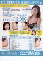
Still the question : will cosmetic surgery become a trend in HK ? Here are the examples of more people going into this "new" category. When more players enter a category, I'm sure they will grow the overall market size together. Look, it's just the beginning and we are still waiting for someone daring enough to invest big and make a big bang. Cosmetic surgery is still a taboo in our society. Who will be able to break it with creative marketing ? Let's see. BTW, Dr. Reborn is quite a brand name !

番齒兵 print ad

Image
Sometimes we don't have to be too creative to do a good ad. In this 番齒兵 print ad, it just features a big frightened face to convey the problem. It succeeds in associating with the painful moment when seeing the dentist. Good ad can be as simple as that. Not particularly creative but it wins on relevance. The only executional suggestion is that a darker background could have been used. A grayish background is not bringing out the scary silvery dental tool visually.

New Town Plaza CNY ad

Image
I have saved this Chinese New Year ad for quite a while as I have been trying to figure out the thinking behind it. Maybe I'd better off show it to you and let you help me. It tries to play with "雙喜", that we all know. But what is the 喜-look-alike word on the right ? I have looked at it at different angles and tried to figure what it means. To me, it reads "HAFY" (?). Other than that, anyone has any clue ? Is the ad too clever or am I just too dumb ?

Yumura Slimming Green Tea advertorial

Image
What is advertorial ? An advertising that pretends to be an editorial. It's not an easy way of advertising at all. You need even more creativity in writing to make it work. Otherwise, it is just a long copy ad that no one would want to read. In this case, the headline is a good disguise to start with : a health warning from Department of Health (even with its logo !). But when you read on, it's an "obvious" advertising. The competitive comparison, users' testimonials and professional endorsement are all within our expectation of a typical slimming product ad. Let's not be that hard-selling in advertorial. Advertorial is about using information and stories that are of interest to the readers like editorials to soft-sell our products.

Masami print ad

Image
Masami, a brand of underwear and pantyhose that cannot only shape you up but also make you slimmer. According to university research, the pressurized massage action is proven to reduce fat ... it slims you up while you walk ! As the ad says, it's magical. In order to make it more believable, it also stresses that all of them are 100% manufactured in Japan. You are kidding me if Japanese don't kid consumers. In fact, they are very innovative in coming up with gimmicky products claiming various functions : 遠紅外線內衣, 備長炭煮飯, 磁力按摩 ... it's up to you to believe it.

Predige facial masks

Image
Bird's nest facial mask is not new. The effects of eating bird's nest on complexion is documented in traditional Chinese medicine theories. Believe it or not. It's up to you. But I never heard putting it onto your face would have any effect. How about facial mask that is made with Caviar ? I only know it is very tasty. It can do good to complexion ? You must be kidding me. It's priced at 5 pieces for HK$138. Not expensive to give it a try. But don't expect it will turn you into 林志玲.

Advertising war

Image
Got these from my friend : In South Africa there's been an advertising war among the top end carmarketers, make sure you open each attachment in sequence from first to last. Look at the pictures in order!!! 01. BMW starts an advertisement. 02. AUDI answers. 03. The Japanese wanna say something as well. 04. The CEO of BENTLEY starts an advertisement to answer all the other advertisements.

HK Electric Writing Competition

Image
A writing competition held by HK Electric. The topic is something like "The moment of my life without electricity". What a clever topic ! Look, the responsibility of an electricity supply company is to ensure that we have continuous supply of electricity for our daily lives. How come they would ask us to imagine what will happen when there is no electricity ? Guess it is such a silly idea to advertise about. They are leaving half of an expensive ad space for people to write and submit their entries. Two thumbs up !

Virjoy toiliet paper

Image
Virjoy is a brand of toilet paper positioned as an economy alternative to those more expensive brands like Andrex and Scott's. In my impression, while Andrex is selling at HK$30 for 10 rolls, Virjoy is selling at HK$20. A HK$10 gap is in fact attractive enough for consumers to try this lesser known brand. I suspect they are quite successful in capturing market share over time as I'm aware that they have started to advertise. Now they attempt to extend upward with a more expensive version coming with the so-called "cushion" technology. Against the common belief, it is a good example that we don't have to build a brand from the premium end at the beginning.

Osim uPilot print ad

Image
"Product as the hero" can be a very boring execution as creativity is rather limited. However, with good art direction, a supposedly boring ad can turn out to be a great one. Here is an example. I could never imagine a massage chair would look that sexy. Now read the copies. There is nothing much about this massage chair. Instead there are a lot of unrelated copies about its brand mission : your health is our priority ... we are committed to quality ... blah blah blah ... Hello, we are the readers. Please tell us what we want to know about the chair !

Hartford School print ad

Image
Can't remember where I got this ad from but I'm sure it was from one of the travel magazines, either U-Magazine or Weekend Weekly. It looks very much like a travel agency ad, advertising a trip to Hawaii or alike and you get even more confused when this ad appears in a travel magazine. Come to think of it, is travel magazine the right medium for them to advertise ? Those who read travel must love holidaying but they are not necessarily interested in getting into the tourism and hospitality business. Let's think before we really want to advertise. There must be some other means of communicating to the right target audience.

Airport Express advertorial

Image
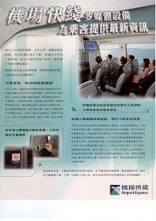
This is an advertorial from Airport Express and it talks about its new multi-media system that provides real-time information to its passengers. It's a value-added service for sure but most of us take the Airport Express because of its speed, rather than the timely information it provides. Compared with buses, its problem is more about the lack of connections to its limited number of station. If they don't think get to the core of this problem, their passenger volume can't be increased. Advertising of such a trivial service won't help at all.

Uni promotion print ad

Image
A pen with a 0.18mm ball point for writing tiny words. The ad uses a demonstration approach to show how small the words can be written by this pen. It comes with a small word writing competition too. But come to think of it, why do we really need this pen ? I can't think of any practical reason other than using this pen to enter the competition or breaking some world's record. It looks like a product invented purely for technical breakthrough sake.

康泰變靚遊

Image
Cosmetic surgery has become the talk of the town. I'm not here to comment about whether cosmetic surgery is right or wrong. But it's a phenomenon that is worth observing. HK people are fast and opportunistic. Whenever there is a trend for business, people will grab it fast. Here is an example from Hong Thai which is now promoting its 變靚遊 to Seoul, including a chance to take a peek at what cosmetic surgery is all about. Looks like Cosmetic surgery will become a new wave after the hype of slimming. Let's keep our eyes open.

陽光茶餐廳檸檬黑加侖子

Image
It's a new launch from 陽光. What does the packaging look like ? Right, Ribena - 利賓納. In fact 利賓納 is the pioneer who sells its blackcurrant syrup to 茶餐廳 and invented 凍檸賓. I heard that it's a success but it doesn't come without hard work and investment. Now that 陽光 tries to cultivate on the franchise of 利賓納. There is no right or wrong in business but I think it's a shame. Will this 陽光 copycat sell ? I put my doubt on it if we consider the principle of positioning. 利賓納 has a strong blackcurrant drink positioning in the mind of consumers, narrow but focused. It's not easy to shaken that position, just like 陽光 means 檸檬茶 in our mind.