Posts

Showing posts from July, 2007

StarWorld Promotion

Image
If you happen to pay attention to the campaigns of those Macau casinos, you would find the works are quite amateur. Like this promotion ad by StarWorld, it just looks like an ad from the 80's even though Tony Leung is the endorser. Definitely they need more marketing professionals to bring up the standards. In fact they are recruiting from Hong Kong and elsewhere as there is a lack of marketing professionals locally in Macau to support the increasing demand by the casinos. I'm sure pay is comparable to HK or better. But like many people said, the casino bubble will burst sooner or later. I wouldn't bet my career on this industry. Would you ?

Hong Kong Jockey Club summer snowball

Image
Hope this post catches you in time to remind you to buy Mark Six tomorrow ! In recent years, HKJC has been spending a lot of effort and money in marketing. On one hand, it is innovating new bet types and investing in advertising and promotions. On the other, it is also trying to level off its potential negative image through various social responsibility programs. I guess it has recruited and will be recruiting more marketers in order to support the increased level of activity. Compared with many companies that no longer invest in marketing communications, it could be a good organization for marketers to work in as it has enough money to spend. However, it may not be the cup of tea for everyone. It depends on your own personal value system. To some, gambling is not something ethical to promote. How would you choose which field of marketing you want to work in ?

Mannings latest TVC

Image
I guess you must be as puzzled as I am when you see the latest Mannings TVC featuring 馮德倫. We all understand its message : "there are surprises whenever you visit Mannings". I can relate the surprise promise with its promotion offers and unique product assortment. But I just don't know how 馮德倫 playing magic adds value to the communication. The link is pretty weak. I think the big winner of this campaign is 馮德倫. He's a singer, an actor and a director and now we all know he's a magician too. The ad just acts to promote him as very talented person. Nothing more and nothing less.

Ngong Ping 360

Image
This is really up to some discussions. After the cable incident, Ngong Ping 360 has heavied up its advertising. If you were the marketing or corporate communication director, would you do that ? One argument is that after the incident, the number of visitors has been dropping sharply and we would need some advertising and promotion to bring visitors back ASAP. On the other side, one would argue that the incident has badly damaged its reputation and time is needed for people to forget about the incident. Any advertising and promotion or anything high profile too early too soon will be ineffective and will only act to remind people of the incident and attract more negative publicity. What do you think ?

Epson VIP service

Image
After seeing so many Epson's ads, I have found a good one at last and it's a great example where the strategy, message and creative are closely linked together. The strategy is to provide VIP after-sale services in order to encourage the use of the original cartridges. The message is of course about the benefits of the speedy service whenever your printer breaks down. And finally the message is presented with a parody creative idea that associates with the Aladdin's lamp and the genie. The whole things make a lot of sense. Brilliant one.

Starbucks Azuki Frappuccino®

Image
Starbucks are everywhere. There are 80+ shops around Hong Kong. It's quite a large distribution network given that Hong Kong is such a small place. Are there that many coffee drinkers in Hong Kong ? I wonder. In fact coffee consumption is not really a mainstream culture like other western countries. With high rental and staff costs, how do they create demand to support such a large distribution network ? Seems that its strategy is to maintain a continuous flow of new drinks appealing to young consumers. This Azuki (means red beans) Frappuccino® is one example. Is this the right strategy ? Time will tell.

MotoSLVRL22 print ad

Image
This seems to be the recent creative direction of Motorola : black and white dominant plus a model holding the phone with a visually attractive pose. Nothing much is said about the phone being advertised. It's more like a fashion ad, kind of unconventional amongst other mobile ads. Is it a good thing to go for such an image direction ? Mobile phone is like a fashion item nowadays, one may argue. It's only half true as attributes and features are still important in consumers' consideration. In fact, mobile phone is a high-involvement product category and by convention maybe, consumers need a right dose of product information to arouse their interest. Consumers would just love to find out what's so new about a new model.

Smart Money investment courses

Image
The stock market is bullish and more and more people talk about stocks and investments. Another phenomenon is that there has been an offspring of investment courses and talks. All in a sudden, there are so many investment experts saying that their secret skills can earn you a fortune. Like this one , it is said that the trainer has a track record of turning HK$200,000 into HK$6,000,000 in 14 months. Isn't that miraculously attractive ? Who doesn't want to make quick monies and get rich ? You can learn these miraculous skills for just several thousand dollars. It's quite a bargain, isn't it ? Well, this is how this kind of courses ride on the quick return mindset. I've been to some of these courses as an observer, some participants don't even know how to use the Internet and some of them are quite insensitive about the current economic affairs. All they want are tips and stock codes. Guess they need some good education for the right mindset about investment i

Fat Out 800

Image
見到D瘦身產品廣告, 又忍唔住寫中文, 今次仲越作越離譜, 唔止, 係離奇, 呢隻嘢話可以reset大腦肥胖記憶, 瘦身唔駛節食! 哈, 唔知大腦肥胖記憶喺邊處? 究竟喺左腦定係右腦? 我淨係知道食D嘢落肚, 只會痾番出嚟, 乜會上腦ga咩? 唔通係K仔? 作都作得科學化D, 每盒HK$538, 信者得救!

Flamingo, diamond simulant

Image
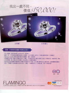
Fake diamond has a better name : "Diamond Simulant". Flamingo is not the only brand in diamond simulants. Another brand is Carat which has shops in prestigious shopping places like the IFC and the Lane Crawford. With the advance of technologies, I'm sure that these simulants are getting very closely resembled to the naturals. And you can buy a one-carat fake diamond ring for just HK$2-3,000, a fraction of the price of a real one. To many people, it's a reasonable price to pay and I heard these diamond simulants are quite popular among the OLs. Is it really good value for money ? It's all about the psychology of reference pricing. People find these diamond simulants reasonably priced because references are made with the real natural diamond. According to the website of Flamingo, its simulants are made from carbon under extremely high temperatures and pressure, like the formation of natural diamonds. Carbon plus mass production, I guess this business could be pro

Claims Direct HK

Image
It's a really down-to-earth TVC and it is only aired after midnight on TVB. It's not an ad worth talking bout, you think. We are used to commenting about advertising ideas and executions. This time I would like to use it as an example to bring out the relationship between strategy and advertising. If you don't have good strategy, it's not easy to sell even with a brilliant ad. On the contrary, if your strategy is right, it wouldn't necessarily take an ad that costs you an arm and a leg. While hundreds of financial companies and banks are focused on credit cards and personal loans, this Claims Direct HK is positioned as the accidental claims expert. It comes with loans, claims, legal and rehabilitation transfer services, all under one roof. It simply occupies an unique space or a niche in the market and its ad just serves to promote awareness and communicate its positioning. The market for accidental claims services may not be too big but I'm sure it is in the t

Megaman TVC

Image
This Megaman TVC has been nominated in the TVB Most Popular TVC Awards. It's a brilliant TVC, straightforward, easy to understand and humourous. What if I tell you it is a very similar to an old Tuborg beer ad from Denmark ? Take a look at the TVC below. The creative idea is exactly the same. But I still do think the Megaman TVC is a brilliant one. One one hand, as marketers, we need to watch more and see more to get more inspirations and also avoid "idea twins" that could be presented to us by the agency. On the other, we should keep an open-mind. After all, any idea that hasn't been exposed or seen by our audience could be of potential to be a great creative idea. If you were the marketing director of Megaman and had seen the Tuborg TVC before, would you approve the storyboard ? I would.

4As 50th anniversary print ad

Image
Thanks Marc for contributing this topic. 4As has been accused of plagiarism and looks like there are quite a bit of talkabouts. It has been critized that its 50th anniversary print ad is an imitation of the works, Hope and Fear, by Philip Toledano , an UK photographer. So is it plagiarism or not ? Well, I still believe creativity is about re-composing what already exist. Pure originality is very rare. After all how many Warhol, Da Vinci, Monet, etc are there on earth ? There is no denying that this 50th anniversary campaign was "inspired" by the works of Toledano. But it is only the basic visual idea that has been "borrowed". The message of the campaign is "helping brands to 省靚招牌 for 50 years" and we see the ad executives wearing brushes, sponges and stuffs, working hard to 省靚招牌. Like the idea or not but this is actually the creative representation of the message, as we see in the TVC. Visually they are pretty the same but the message and the central c

Walch body wash naming

Image
Walch body wash has just launched a new TVC, which reminds me to talk about its interesting way of naming. Within its body wash range, each variant is given a number : 300, 500, 600, 800 and 900. To consumers like me, all these numbers are meaningless as they don't tell anything about the smells, the ingredients or the benefits. Such way of naming is unique for toiletry products but it adds complications to communications. In fact, each number carries some nonassociative meanings : 900=健康 , 800=经典 , 600=活力, 500=清爽 and 300=滋润. Walch is a relatively new brand which has been quite successful up against Dettol (it managed to make its name during SARS). Some people said that it's a Mainland Chinese brand pretending to be German. Looking at the way it brands the products, I tend to believe that.

United Vacations print ad

Image
This is what I call "all-you-can -paste" ad. It's a classic where you can take it as a little quiz/competition : - How many different fonts ? - How many different font colours ? - How many pictures ? - How many website addresses ? - How many highlighted messages ? You win if you manage to figure these out in 3 minutes. Another interesting thing about this ad is its use of fonts. Some of them are not very easy to read at all. Notice the funny font of 「非常星加坡」as well ? It's quite ugly indeed ...

Credit Gain TVC

Image
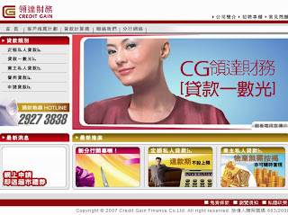
Have you watched the TVC of Credit Gain ? If not, take a look at it in its website . I wanted to talk about it a while ago but it seems that its website is only up and running lately. I can see the creative attempt in drawing an association between hair (煩惱絲) and debts but the analogy is a bit weird, isn't it ? It is literally saying that getting rid of your debts is like shaving all your hair. The only merit of this TVC is the stopping power of the bald lady talent which can be used as a powerful visual for other marketing materials like POP and print ads.

3 brand colour

Image
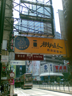
There is one basic principle in brand management : a brand should own its brand colour(s) in order to maintain a strong identity. In telecommunications, One2Free is black and yellow (same as 1010), PCCW is dark blue and Smartone Vodafone is red. If you ask me as a consumer what the brand colour of 3 is, I will say I don't know. When the 3 brand was launched, I already noticed that its logo could be in a variety of colours in a random kind of a pattern (you may take a look at its website . The colour of its logo keeps on changing by animation). Another principle of brand colour is to own colours that are different from your competitors. I just came across this sign in Causeway Bay. It is in black and yellow. It is quite eye-catching but will consumers be confused that it is from 1010 or One2Free ? Is this ignorance or negligence ?

MTM Eye Mask print ad

Image
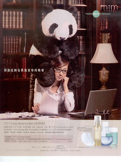
This is quite a good ad. The interesting visual says it all. The agency has done a great job for coming up with such a cute representation of 熊貓眼. It shows us again that it doesn't always take the big bugs to employ celebrity to sell, even for beauty products. Money can be better spent on creativity. The only little imperfection of the this ad is the background. It's just too dark and buries the key visual.

變靚D reality show

Image
Will cosmetic surgery become a trend, like slimming ? I talked about it in my post in March, saying it could be a marketing casestudy. After all I'm not a fortune teller but just an observer. It seems that 變靚D is trying to get the heat up by sponsoring a "reality show" that I watched last night. Throughout the program, it is trying to brainwash us that after all the pains and frustration, cosmetic surgery is worth it. I heard that the program has been complained by many viewers. Again, I'm not here to judge whether cosmetic surgery is right or wrong, in moral or ethical sense. But the fact is TVB and 變靚D are partnering up to brainwash consumers an one-sided message about cosmetic surgery. In the past the media used to play a scrutiny role in different social issues and trends. Consumers can then judge by themselves from the positive and negative sides of an issue. Now that such role is gone due to commercial reasons. Will TVB's other news program like 星期二檔案 or 新聞

Shake Shake Jelly 粒粒爽

Image
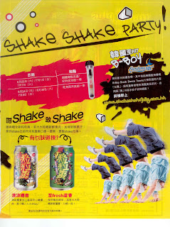
Jelly drink is rather dated product category. Who was the pioneer in this category ? Yes, Yeo's 楊協成. A dated brand, a dated category. Now that it is trying to revitalize the category by bringing it back to the young generation. New product, event marketing, print ad and website , all with a hip hop tone. The packaging design is not my cup of tea but if you take a closer look at it, the Yeo's branding has been played down. Also there is no mentioning about the Yeo's brand in the print ad copies. It is understandable as Yeo's is too old a brand that could appeal to the young generation. It could be the right decision but it's also the potential problem. Without a clear corporate brand endorsement, 粒粒爽 has become a standalone brand that is literally new to consumers. Hefty resources would then need to be invested to kick-start it in the competitive drink market. Does it have what it takes ?

Wall's Wii promotion

Image
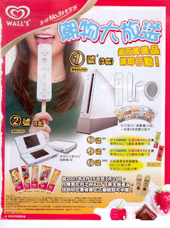
Here is an example of how execution ruins a good creative idea. The idea is simple and to the point using "mixing and matching". A Wii control on ice lolly stick says it all about this promotion. This key visual could have been played up and made the focus of attention. Too bad that it is too greedy to feature all the "big" prizes, making the ad rather cluttered. In fact we don't have to do that as we all know Wii is Wii, NDS is NDS even without these big shots. In execution, size does matter.

I'm not a plastic bag

Image
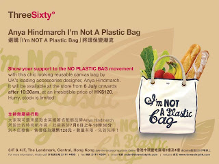
Generating publicity can be as simple as this : selling a designer bag at a very low price with a limited quantity. It was said in the news that there were 5,000+ people queuing up at the Landmark. 執輸行頭慘過敗家, such mentality is universal and this old track always works (look at the launch of iPhone in the US). After all, it's just a canvas bag with a few funny words on it, worth less than HK$30 at cost. It's now selling at HK$1,500+ on Yahoo Auction. Lack PR idea ? Here is one worth considering.

Luk Fook panda series promotion

Image
A reader would like me to give some comments about this promotional ad. It is about a series of panda commemorative products for the 10th anniversary of the handover. Quite interesting that it takes panda as the metaphor for good man, rare and hard to find. Guess most women would agree with that and it's quite an insight about what women think. However, when I looked at the products on its website, the designs are not very attractive and not giving me the feeling of "rare". The ad is strong while the products are weak. Not a good match, too bad.

Sony Ericsson's Night Tennis

Image
One of my friends has asked me to check out a new event being organized around the world by Sony Ericsson. Night Tennis is not a sport event but more like an UV party blending tennis played in the dark, fashion shows, DJs and of course a lot of drinks. Would you call it creative ? Creativity is sometimes about re-composing existing elements and making it big. Remember night blowling ? Anyway, it should be great fun but too bad that Hong Kong is not yet in the schedule.

何嘉麗 in TaiFook Securities' print ad

Image
A reader has chatted with me about celebrity endorsement last night. Here is an example of mis-match. Accuracy and on-target is the key message but what does 何嘉麗, a fencing champion, have to do with security trading ? The link is rather weak. In fact the money for the endorsement could have been better spent on creativity, i.e. hiring a good ad agency to develop a creative solution to convey the message. Speaking of celebrity endorsement, Laura Ries has just happened to talk about it lately in her blog . Check it out too.