Posts

Showing posts from May, 2007

Kleenex Let It Out campaign

Image
Having read my comments about the Tenpo's campaign, a reader asked me how I feel about the latest Kleenex Let It Out campaign. First of all, it is always good to see ambitions in a campaign. Real people, real story, famous director and high emotional appeal. However, I think it runs into a common problem of emotional campaigns where it fails to connect back to what the brand already stands for or want to stand for. If you find an ad that potentially works the same for any other brands, it's not the campaign for your brand. Imagine what if the the end logo is replaced by Andrex, Scott or alike ? Emotions are generic in a way. The key is how to use the emotion to tie back to the product or the brand's USP. For example, if Kleenex equals tissues with high strength among other competitors, we can pick stories focused more on how people find strength to live on in adversities. And the line can be changed to "Kleneex gives you strength". Just some thoughts.

Zwilling promotion ad

Image
I may be too critical but to me, it's a rather strange ad. Zwilling is a German brand of high quality knives and scissors. I wouldn't say it is not logical to extend to manicure sets as it's still about "cutting". But is the demand for manicure sets that high ? High enough to make the fuss to advertise ? What's so special about this manicure set ? It is endorsed by Lufthansa (???) and it can 伴你傲遊天際 (!!!). Long haul flight on Lufthansa and got nothing to do ? You can cut and file you nails ! That's not too polite but you can "follow the heart", it says. BTW, are we allowed to take these shape metals into the cabin ?

Mass Mutual Jr. Space Camp

Image
This is quite an unique corporate image building initiative. Astronaut training is definitely an once-in-a-lifetime experience for the kids who are smart enough to win the chance to participate. It actually reminds me of the Cathay Pacific's "You Can Fly" program that also works in a similar way. Which one is a better program ? Well, both are good in its own right but what if we judge them based on image/positioning match ? "You Can Fly" is a program derived from what Cathay Pacific does and the association is strong. This Jr. Space Camp program, however, has a rather weak association with Mass Mutual, a lesser known insurance company compared with AIA, AXA and ING. In fact it is a perfect program for Mass Mutual to build a specialist image in children-related insurance and investment products (if it wants to). Apparently it has been running the same program for the last 7 years and too bad it hadn't leveraged on it.

Ichi More

Image
As far as I know, Red Bull has been pretty successful. it's quite popular amongst the younger generation at the night outlets. It has become the in mixer with vodka, gin and whiskey at discos and bars for you to stay the night. In view of its popularity, there are imitations in attempt to share a spoonful of the market. Here is one of the examples. It simply shares the same positioning as Red Bull with a Japanese touch. And if you look at the copies which spell out the details of the products, you would reckon that this is pretty much the same as the faded brands, Amino Gear and Libogen (力保健). Will this brand/product win a good share in the battle of positioning ? I doubt it. Positioning, once again, is about differentiation. Selling parity will get you nowhere.

UA Finance Mortgage TVC

Image
The ads of UA Finance used to be quite good but this one really sucks. My different friends in marketing have talked about this ad for its bad taste. One friend even said that it attempts to imitate the PrimeCredit TVC which uses the old song of 鄭少秋 as the jingle. I don't know whether this is true. In the PrimeCredit TVC, the song, the acting and the singing are parts of the creative idea : an analogy between the company and good friends/brothers who help you when you are in financial difficulty. But in the UA Finance one, it lacks a creative idea. The idiotic singer/present simply sings the message. It's supposed to be funny but in fact it's irritating to most people.

Tempo's TVCs

Image
Speaking of creative promotions and advertising, have you seen these two TVCs of Tempo ? The new Tempo with jasmine wakes you up and refreshes your mind. The intended message is loud and clear. In the first one, the break-up scenario of a couple is funny. However, I find the second one a bit too playful with potential negativity. Seduced by your tennis coach, you are wakened by Tempo from the sinful thoughts. I guess this is inspired by the popular drama series, Desperate Housewives. It is definitely creative but what would the consumers think ? Will it offend female consumers ? If you use it, you can be seen as one of the desperate housewives !

Tung Chun promotion

Image
Anything creative in this ad ? Nothing. It's just a simple product ad plus a promotional message of a Towngas cooking class teaching you how to cook 薑醋. Boring, you say. Look, it's not easy to come up with a promotion idea that is both RELEVANT to your product/consumers and CREATIVE at the same time. As marketers, we launch dozens of promotions a year. Can we be creative every time ? Not really. Yes, we should constantly look for creative ways to promote our products but to me, relevance is the important basic requirement for every promotion. Over time, we have seen too many promotions and advertising that make us scratch our heads. This one is a boring promotion ? Think again. What else would you do ?

bbTV

Image
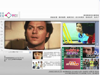
Seen the latest TVC of bbTV ? It's quite a massive campaign with double-page spread newspaper ads as well. The TVC is not bad at all : two boys 鬥認叻 to bring out the message "I have what you have", a head-on competitive message against Cable TV. It's a good ad but is the thinking behind it good ? In the game of positioning, the principle is about differentiation . We just don't position to be the same as the competitors and we don't communicate parity but point of difference. Is it cheaper, high quality, better or what ? Only strong point of difference would attract consumers.

KFC vs Cafe De Coral

Image
Coincidentally, both KFC and Cafe De Coral are advertising about their dinner specials at the same time. At night, you can now enjoy a proper "sit-down" dinner at KFC while Cafe De Coral serves make-to-order dishes. The thinking is logical and obvious : at night fastfood restaurants are usually less busy and with these dinner specials, they can demand higher prices. Rentals and wages are so high in HK and this is how these fastfood chains strive to make extra bugs. Don't know whether they will be able to steal some business from 茶餐廳 and other "sit-down" restaurants. But to me (a stubborn consumer), KFC and Cafe De Coral are fastfood restaurants. I won't go there for 小菜 or set dinner. These are the places where I eat and run. There are more choices and varieties at 茶餐廳 for the similar price.

Aveda ??? ad

Image
This ad caught my eye because of its line. It does provoke some emotional response. Knowing that Aveda is a brand of skincare salons and products, I thought it must have lined up some charitable activities like sponsoring something or donating some monies. Societal marketing we call it. But you read on, I guess you must have same reaction as mine. Huh ? What is it trying to tell us ? It's alright to try to kill several birds with one stone. But at least it has to tell me more about "fight for clean water". I feel kidded in a way. The intention of this ad is just a myth.

HP AMD Proliant Servers

Image
While most server brands stress on high performance and reliability, HP positions its server as the energy-saving server. I'm not an IT guy and don't know whether energy consumption is a major concern but it sounds like a good positioning to own. Occupying a new need or new benefit is a common positioning strategy. To be successful in the positioning game, however, we need to be unique and market-first. Another consideration is a practical one : money. You will need to have enough resources to come up with a marketing communication mix to reach out your target market and pre-empt your competitors. Does it always take the big bugs to communicate ? Not necessarily if we are focused enough on who we want to talk to. Like this ad, it appears in Next Magazine which represents high wastage if it wants to reach out IT people. There could have been more on-target alternatives to mass appeal advertising. PR, database marketing, trade shows and so on could be more effective.

NOW 501 美膳專遞

Image
Shopping on TV have never been popular in Hong Kong. It's a business where people have tried and failed. Shopping is so convenient in Hong Kong and people just take it as the major past-time during holiday. When it comes to shopping, they just don't stay at home, look out for merchandise to buy on TV and wait for the deliveries. They will only do that if the same things are cheaper than the shops out there. Now that NOW has launched this food delivery channel. Some of the restaurants are quite famous but they are not cheap. For the same price, I'd rather go to these restaurants to enjoy the freshly prepared, steaming hot food on the spot. Don't know how long this business can be sustained ...

Show Mi sponsors

Image
Dear fellow marketers, let's be careful in dealing with event promoters. Your sacred A&P could be given to the wrong hands. Sammi's concert is on. Who owns it as a major sponsor ? Is it Hennessy ? Probably not. It might have just given a small sponsorship in exchange for some tickets for promotion. It then advertises about the promotion, giving consumers the feeling that it owns the concert. In fact the title sponsor of the concert is King Fook (see below). Don't want to get diluted ? Next time when you are approached by event promoters, look carefully at the terms and conditions. Event promoters just don't care as they make profit by using YOUR money to get exposures of their events.

Johnson's Baby Bedtime Bath and Lotion

Image
Saw its ad on TV ? Tell you what. It's more than advertising. It's a demonstration of positioning strategy. There are different ways to position a product or brand and in this case, it is about positioning by use or application. As the brand name implies, these products are for putting your baby into good sleep. You can expand such an application positioning in two ways. First like in this case, giving direction of use (step 1, 2, 3). Second, defining the situation of use. Examples include Kit-Kat for taking a time-out in the afternoon, Campbell soup for making a quick lunch for kids after school and so on. Sounds academic but positioning is a crucial concept in marketing. Let me talk about other positioning strategies later on.

Drinkazine Mugicha (Barley Tea)

Image
This is a fresh attempt in the boring FMCG market. It's a range of Mugicha. Ready-to-drink Mugicha may not be the newest product but the way it is marketed is quite new. At the beginning, just by looking at this ad, I thought it was just another consumer promotion. Then I visited its blog and I found out more. The brand name of this Mugicha is "DrinkaZine". The idea : "It Is A Drinkable Magazine! 以雜誌形式包裝,既是一支『解悶的飲料』,又是一本『解渴的雜誌』。" The labels are like magazines where you can drink and read at the same time. It's definitely a creative idea. My only worry is that if the product doesn't sell fast, its labels and hence the magazine contents can't be changed frequently enough to deliver the promise as a magazine. And I guess that's why it has a blog as the core communications channel. Its blog is pretty good as it carries relevant contents, projects an brand attitude and creates a community, all of which young consumers can associate with. I bet this

Awards of Airland

Image
Awards have become a popular tool for people to build credentials for their brands. And more people start advertising about their awards. It seems the more awards you get, the more credible is your brand. Yes, advertisers like awards and there are so many awards out there "for sale". Awards from various associations, from different magazines, online media and retail chains, you name it. I guess the most profitable award granting organization is Superbrands where you pay certain amount of money, get an easy assessment and you can just use its Superbrands logo anywhere you like. That's why there are so many so called super brands around, including those brands you have hardly heard of. A matter of supply and demand indeed. But shall we use the money to really build our brand through well thought-out positioning and good marketing mix ?

EDO Xylitol chewing gums

Image
It's not easy to steal share from Wrigley's Extra. Xylitol is the sugar substitute said to protect your teeth. Wrigley's Extra has already "owned" this ingredient in the mind of the consumers through its 晒駱駝 campaigns. Years of investment have been put to build such dental care positioning. Success doesn't come without hard work, focus and consistency. Now that EDO is basically positioning its chewing gums the same as Wrigley's Extra. Chance of success is slim. After all positioning is about differentiation. Copycat's mindset will not get you anywhere.

Volvo C30

Image
Hot hatch is the trend in cars. Believe it or not, Volvo has launched a hot hatch. Will it sell ? I doubt it. The brand means safety and it carries a robust, mature and conservative image. Hot hatch is about fun, youthfulness and flexibility. A Volvo hot hatch is simply 性格分裂. Guess why the ad only features the back of the car. See below which unveils the front. Yes the front just looks like the big safe Volvo your uncle drives. Who on earth would buy it, while there are so many other choices ? Lucky if 10 are sold. But when we see this car on the road, let's check out the driver : see if he or she looks like 性格分裂 .

Scholl high heels ?

Image
Scholl, another old brand. It's never easy to keep a brand evergreen and usually brand and line extension is the way to go where new products can meet new needs and new trends. That's is also where the trouble comes from. Scholl means comfortable scandals and foot care. Now that it has high high heels ? Although these shoes are said to come with comfortable sole padding, the link with its brand equity is rather weak. Also it is stepping into the bigger, competitive market of fashion where design, variety and fast pace is the name of the game. I'm worried that Scholl may not have the marketing muscle it takes to compete in such a market.

Residential property ads

Thanks to YouTube, I have found the archive of the Beverly Hills TVC that uses Fung Shui as the selling point. The whole ad is a joke. Who on earth would use superstitious claims to sell a product publicly ? Guess only HK advertisers can think of that and I wonder how this ad can pass censorship too. Another funny thing about the advertising of the Beverly Hills is that on one hand it uses European royalty and glamour as the angle in one ad and Chinese Fung Shui in another. That's creative, very creative indeed.

Visa TVC featuring Jackie Chan

Image
Just saw this Visa TVC featuring Jackie Chan. Costly celebrity and expensive production. Although it's still the same old monkey act of Jackie Chan, no one would disagree that it's an enjoyable ad. Compared with Mastercard, I like Visa ads more. But why Mastercard and Visa invest so much money in advertising to compete with each other ? To consumers they are pretty much the same thing. It doesn't matter which card I use as almost all merchants accept both anyway. I keep both in my wallet and somehow I have the tendency of using my Visa more. Guess it must be the subliminal effect of advertising where emotional wins over rational. Does anyone know the share of mind and share of market between Mastercard and Visa ? Which one is bigger ?

The latest ING TVC

Image
無厘頭 in advertising is back ! This TVC reminds me of the Sunday TVCs in the past. The kind that you either hate it or love it. Yes, it's creative for creative sake but undoubtedly it's catchy and interesting to watch. "吓, 咁都得 ?" is the usual response. I'm aware that it creates quite a bit of talkabouts on the net and it's a success already. There aren't too many ads worth talking about and remembered anyway. Putting aside the wacky execution, I wonder why it uses 無敵鐵金剛 as the creative entry point. This drama series was from the 80's (?). Only the old guys like me would find it funny but the new generations may not be able to associate.

HSBC credit card acquisition program

Image
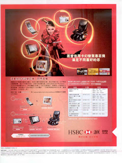
HSBC credit card acquistion offer is on again. If I'm not wrong this is the 3rd or fourth time HSBC launches such an attractive promotion. iPOD Mini, iPOD nano, PSP in the past ... this time you can get a free Samsung DC, or buy Samsung tablet PC or OTO massage chair at almost half price. In conjunction with this acquisition promotion, there is another utilization campaign going on concurrently : up to 50% 全城最紅 restaurant discounts in TST and CWB. Seems that HSBC is determined to wipe out other smaller credit card competitors and in fact there is no way for them to compete directly with it. If you notice too, there is no other credit card investing monies in big campaign nowadays and their acquisition and utilization programs remain at below-the-line level like roadshows and direct mailings. And The smaller players' focus is not on acquisition or the traditional way of utilization. They are working on credit line conversion for existing members. I have received dozens of DMs a

Craeting the buzz

Image
PR is playing a more important role in our marketing communications mix. Why ? Our A&P budgets are too small to afford us to advertise and we have to think about the cheaper alternative of PR. Yes PR could be cheaper and more credible than advertising but good PR is never easy. The press simply would not write about you if you don't have new news. By new news, you have to be either the biggest, the newest, the most expensive, the sexiest , the most daring, the most wanted or the most unusual. Going for the PR route could be more difficult or even more expensive than advertising. No such great PR angle and you have a small budget ? Let's spend the money on the basics : sampling, merchandising, sales promotions and so on. PR is more than looking for a movie to sponsor, putting a small logo in an event poster and selecting a movie star for photo opportunities.

Patanol Eye Drop print ad

Image
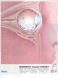
This is another example of how execution fails to deliver an idea. The creative idea is there. A surreal representation of the problem - when you have itchy eye, it's like ants running around inside. Not a bad idea at all. However, the colour combination kills it all. Everything is pinkish and the tiny ants are in brown colour. Such combination just fails to bring out what it wants the readers to see. If the ants were in black, it would be better already. There must be a thousand more colour combinations that work. Is it ignorance or negligence ?

Double Star TimeOut joint promotion

Image
When two brands come together to do a joint promotion, cross-selling is the ground for real partnership. In this promotion, the consumers of Double Star have a chance to sample TimeOut from its dessert menu while the consumes of TimeOut can enjoy discounts at Double Star. You may say this promotion is not too creative or attractive but it's at least a demonstration of logical partnership. There are simply too many wrong marriages. It is already better than the strange joint promotions between San Disk and Haagen Daz, Tic Tac and Fairwood, and Bonluxe and Park'n Shop that I talked about before.

Tic Tac Fairwood joint promotion

Image
Joint promotion is the name of the game nowadays. The simple reason is that we all have tight A&P budgets. Coming up with a good joint promotion is not easy. Ideally we should find promotion partners that share the similar brand image or target market so that there is real synergy, true partnership. However, many joint promotions are done just for the sake of giving away something. Like this one, I just can't figure out how fast-food is associated with candies. We can always do better than lining up someone who is willing to give away something, working out an unattractive ad, putting up a though-to-be catchy headline ... and hiding away the actual terms and conditions of the promotion. (This promotion looks attractive but in fact the T&C says you need to spend at least HK$17 at Fairwood in order to enjoy the offer).