Posts

Showing posts from February, 2007

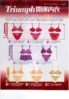
Embry Form and Triumph "Red"
Image
All these remind me that Chinese New Year is the right season for selling underwears, selling red underwears in specific. Red means good luck to Chinese and the logical combination is Red Temptation like in the case of Embry Form and Triumph. Triumph even pushed the idea further by promoting Purple and Golden underwears for different kinds of luck. Click on the image and look at the funny descriptions. There are so many lucky choices that it's hard to decide which one to buy !

The HK Jockey Club Valentine's Day Promotion

Image
Yes I'm a bit late to talk about Valentine's Day promotion. But this is a very interesting one. Even the Jockey Club did a promotion on the Valentine's Day. Tell you what. It was a Wednesday on Feb 14 this year, also a race day. So I guess the Jockey Club tried to "rescue" some business on the special day when people must be all gone to romantic dinner. The trouble is : would you bring your girlfriend to the race course on that day ? I bet your girlfriend would be very mad if you did. This promnotion should be a waste of money and effort.

梁朝偉 星際酒店 TVC vs Smartone TVC

Image
Thanks to the agency of 星際酒店, we are all confused between the previous Smartone TVC and the current 星際酒店 TVC featuring 梁朝偉. Same sound track is used in the two. Everytime I see the 梁朝偉, I thought the Smartone ad is on again. If the clients in 星際酒店 watched TV, I think they wouldn't have approved it. So let's not sit in the office all day all night. Be sensitive to the things around us. Watch some TV, read some magazines and walk around in the streets. We can avoid idea twins.

Funny Beer TVCs

Image
Been collecting some beer ads for a workshop. Came across these funny TVCs. No analysis on them. Just for pleasure. Enjoy !

HP and Epson printer ads

Image
There are loads of printer ads like these two. All printer manufacturers claim that their printers produce the best quality print. The printouts are so real that you can take them as the real physical objects. The claims are all the same and the creative ideas are so similar. How can these brands stand out from one another ? Hope there will be some creative breakthroughs.

昌記魚旦 promotion

Image
Everyone likes having hotpot at home during winter. It's the right season for selling fishballs and it takes some sort of promotion to give sales a boost. I can understand the logic. But a trip to Moscow ? I don't get the connection between fishball and Moscow. I think they should come up with a promotion better than this. And branding is extremely weak in the ad. If you don't pay attention like I do, there is no way to tell it's a 昌記魚旦 promotion.

Nature's Way print ad

Image
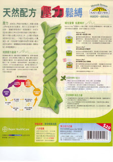
Speaking of health supplement, here is an ad from Nature's Way. It tries to sell three of its products as the stress health solutions. There are quite a bit of copies : 1. description of stress 2. how stress affects your health 3. how the products can help 4. some useful tips for dealing with stress 5. the quality story of the products. Very information rich but who would read it all ? A "fill-it-all-out" mentality. But the one thing I appreciate is the HK$20 cash coupon at the end. It promotes actual purchases and it's a way to measure the effectiveness of the ad by the number of coupons redeemed.

Amway Nutrilite

Image
Simple message : "Nutrilite is the most natural health supplement." Support : all listed in the bubbles. It's quite a dull ad. But it's funny to see them start advertising. In a typical network marketing business model like Nutrilite/Amway, marketing communications are done through their agents and it is all about personal selling which is an effective (but a costly) way of communication. Unlike retail brands, consumers can't find and buy the products in any shop even though they are convinced by the advertising. Why do they advertise ?

Happy Chinese New Year

Image
Happy, Healthy and Prosperous Year of the Piggy! (Daily post resumes on Feb 21)

Golden Elephant thematic ad

Image
There are prints and TVC in the thematic campaign of Golden Elephant showing the little and grown-up 方力申. 金象米伴你一起成長. Now that the use of 方力申 has started to make some sense at last. 方力申 grows up (and old ...) with 金象米. So do we. It's a cliche saying by many long-established HK brands but at least it's an emotionally appealing message. 集體回憶嘛 !

Aiken Cream

Image
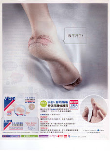
From the ad, cracked heel seems to be a very terrible problem. Is it common for women wearing high heels ? Or is it just related to dry skin ? Anyway, the ad is quite creative making the cracks look like a painful face. Simple idea but well-executed to draw our attention to the problem. Every time I see clever ads from small brands, I always wonder who are their ad agencies. I know it mustn't be the big ones. There got to be some small good ones. Who are they ? How can we find them ?

PolyU TCM Research

Image
PolyU has a subsidiary company that sells Traditional Chinese Medicine health supplements. The brand name says it all : 理大精研. Let's not argue whether it is right or wrong for an university to go so commercialized. We all have to agree that university is a powerful endorsement to gain trust and credibility. But funny enough, their advertising also uses celebrities to endorse their products, like everyone else. Is it necessary at all ? If it sells, it should sell on the name of the university. They don't need to waste the money on celebrities while potentially diluting their professional/research-based image.

AgeMed advertorial

Image
A miraclous wrinkle remover said to make you 10.1 year younger and it is clinically proven to remove 10% of your wrinkles in 7 days. Don't believe it ? There are celebritiy endorsement, testimonials from the users and statistical charts. Still don't believe it ? You can give them a call and make an appointment with them to give it a try. Too much information and trying too hard to make believe. Actually it is working the other way round. Let's think about the consumers. Too hard selling turns people off.

First State investment fund

Image
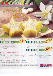
If we put away all the copies and headlines, what kind of ad does it look like ? A spa ad or a healthy eatery ad ? Can you ever think it's selling investment actually ? Their logic, I guess, is straightforward : they want to position their investment as the star choice and hence they use star fruit as the association ! Simple thinking, isn't it ? But star fruit and investment fund are light years apart. You just imagine why the client who would approve this kind of ad totally irrelevant to his product ...

Kowloon Dairy Mochi

Image
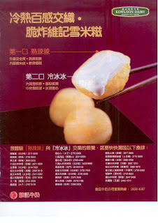
Looks like Kowloon Dairy is trying to get its mochi into the food service sector and sell it to dessert restaurants. Deep fried ice-cream mochi. A very tempting dessert, particularly for the winter time. Hot mixed with cold. Definitely an enjoyment. Here is an ad to tell you about the enjoyment and where you can find it. There is a listing of like 30 outlets. Will consumers look at the list at all ? Not really. The objective of this kind of ad is to entertain the trade. That is you just kid the lined-up outlets that you are supporting them with advertising. Consumers just don't check the list and make a special trip to go there because the outlets are deep-frying Kowloon Dairy Mochi !

Nike Plus

Image
When I saw this ad, I wondered what it is trying to sell. Some cross-over between Nike and Apple iPOD for sure but what is it all about ? No body copies, no elaborations. The only clue is their website www.nikeplus.com.hk (the small print at the top left-hand corner). What a COOL ad ! I have checked out the website already. An interesting and great innovation for runners. But I'm not going to tell you what it is exactly as it's not my responsibility. Ads are supposed to provide product information to sell. It's their job. Not mine.

蒙牛特侖蘇牛奶

Image
The key message : some milk has won some award. When I looked at it, I was somewhat confused by the ad. Branding is all over the place. First I couldn't easily tell this 特侖蘇 is a brand from 蒙牛. Strange that they didn't make the mother brand more prominent on the pack. 特侖蘇 is a pretty strange name too and it's hard to pronounce. Guess what ? It's a phonetic translation of the "Deluxe" ! Second, there are unfamiliar names mentioned in the ad : IDF, 古和林格爾, 乳都核心區 ... all these make us, the consumers, scratch our heads as there are no elaboration. Lastly why did they won such a prestigious award ? Because the milk is rich in milk protein. Can't tell ? It's your problem. It is mentioned on the pack ...

SQL Server 2005 ad

Image
The simple message : "Hilton is powered by SQL Server 2005". A crendential approach of selling. The trouble is that it looks too similar, similar to the saying that we have probably seen before. What is that ? Clue : Hong Kong airport. More clue : some billboards at the arrival hall. Yes, SAP. Now you remember : "BMW is powered by SAP". Although executions are different, they do share the same credential way of selling while the message is the same. So what's the downside of getting too close to another brand in a similar category (information systems in this case) ? People are just confused with which is which and you are probably spending your money to advertise for your direct/indirect competitors !

Redoxon promotion

Image
Many marketers have a "I-have-to-do-something" mentality. What kind of mentality is that ? Well many marketers may think : the company pays me and give me some A&P and I have to use the moeny to do something. Yes something, whatever it is. So they look around, meeting different people, ad agencies, media salespersons, premium suppliers, PR agencies and so on, just to find out how to spend some money. I suppose it is how this promotion is born ... when the product manager of Redoxon met the media salesman of TVB ... you want contest ... you have a contest on words of love for Valentine's Day ... you want event ... you have a cake making class ... you want celebrities ... you have celebrities. Anything to connect with the product and its benefits ? None. Sigh ...

Leo Diamond TVC

Image
Seen this TVC ? One lady student asked me what I think. Well I have to say these ads do have consumer insight : some women are really jealous, materialistic and competitive and do want to show off. Although this is the insight, the question has become whether or not it is the right thing to do to explicitly show the "dark" side of the consumers in an ad. Although some women buy big diamonds (or ask their men to buy) because they are materialistic and competitive and do want to show off, they would never want to admit ! Any I'm not a woman. I never know the effect of these ads on women. But I'm sure men hate these ads ...

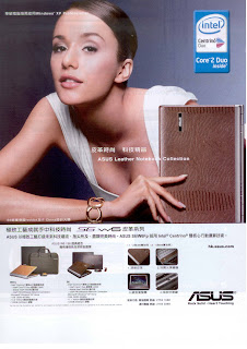
ASUS

Image
ASUS is a Taiwanese brand if I'm not wrong. I'm aware that they are pretty active in building its brand in the notebook computer market. If you go to Broadway and Fortress, you will see more of its notebooks appear on the shelves. They are quite aggressive in coming up with notebooks with sytle and quality like this one. Their ambition is to make a mark in the world's notebook market with quality and performance, like their brand positioning tagline says : Rock Solid. Heart Touching. Not too convinced of the quality of a Taiwanese brand. Take a look at the video below. It may change your perception. Guess I should consider it next time I change my notebook. I'm using a Toshiba which has broken down 2 times in a year ...

Dulcolax Laxative

Image
Is using a knotted banana to represent constipation a very creative approach ? I can only say it looks familiar. It's a typical problem-solution way of selling. The key visual tries to catch our attention about a problem and encourage us to find out more about the solution, i.e. the advertised product. What about the product ? It says this laxative can "pre-set" the timing. Wow what a miraculous product. When I looked at the body copies, it doesn't say anything about how it works. Is it trying to mislead us with overclaims or some copy points are simply missing ? 點解 ??

DBS AMEX Black Card

Image
DBS Black Card. It was launched more than a year ago. Quite a lot of noise was created around it. First it was the first card that gives away 4X bonus points. Second they used a black Ferrari as the lucky draw prize. But has anyone ever won a black Ferrari from this promotion ? In theory, if there was a winner, we must have heard because DBS must have put enough PR effort to let us know. But the funny thing is the promotion is still on after more than a year and this promotion ad appears recently again. So I bet the lucky draw is not as straightforward as we have thought and there must be some tricks behind it. Looks like they want to run the promotion forever by not giving away any black Ferrari.

Milan Station

Image
What kind of ad does it look like ? A hairdressing salon featuring all of its stylists ? Or a tutorial school showing all of its smart-looking tutors ? Look this is an ad from Milan Station which sells 2nd hand LV and Gucci. I can recognize 周汶錡 in the middle but who are the others ? From the small captions, we can figure out they must be the store managers. Now this is something new : idolization of store managers ? But what's the point ? I just don't understand ... dear readers, can you tell me ?